 МИ ПРАЦЮЄМО ДЛЯ УКРАЇНИ
 Input data
 Progress of work
The tasks set before the development team were clearly formulated and included the following key aspects:
- Navigation System Update: It was necessary to completely redesign the structure and visual appearance of the main menu, which would allow users to find information about the product range, particularly various types of zippers and related products, more quickly and efficiently.
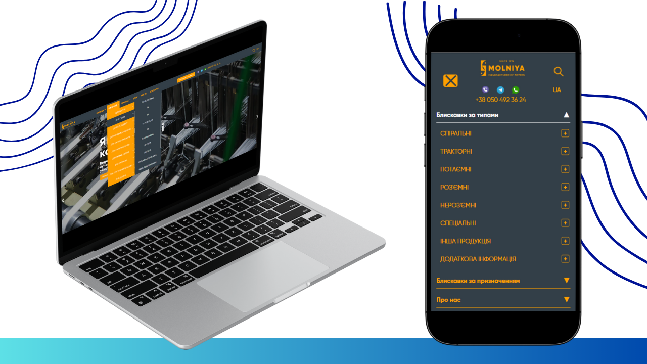
- Adaptability and Cross-Platform Compatibility: It was important to ensure the correct display and functioning of the new menu on all types of devices – from widescreen desktop monitors to compact screens of mobile phones and tablets. This involved developing a responsive design that dynamically adapts to the screen size.
- Expanding “Catalog” Functionality: The central element of the changes was to be the “Catalog” section. The task was set to implement a multi-level dropdown menu with interactive behavior on hover (for PC) and on click (for mobile devices). This was to ensure not only a visual presentation of subcategories but also the ability to directly navigate to the pages of relevant categories or subcategories.
- Improving Visual Interaction: Requirements for visual feedback were described in detail: changing the background color of menu elements on hover/click, displaying arrows indicating the presence of submenus, and clear differentiation between expanded and collapsed states of elements.
- Administrative Flexibility: A key requirement was the ability to fully manage menu content (adding, deleting, editing items) through the website’s administrative panel. This ensures the site owners’ independence from developers for future updates and assortment expansions.
Implementation Stages
Stage 1: Analysis and Planning
At the initial stage, a thorough analysis of the existing structure of molniya.com.ua and molniya.eu.com/de/ websites was conducted, as well as a detailed study of the provided technical description and visual layouts. The development team formulated the technical task, developed the architecture of the new menu, and planned the sequence of work. Special attention was paid to determining the optimal technologies for implementing responsive design and integration with the existing CMS. Possible options for implementing multi-level menus were discussed, and the most effective approach was chosen, ensuring both functionality and performance.
Stage 2: User Interface (UI) and User Experience (UX) Development
At this stage, prototypes of the new menu were created, taking into account all requirements for visual design and interactive behavior.
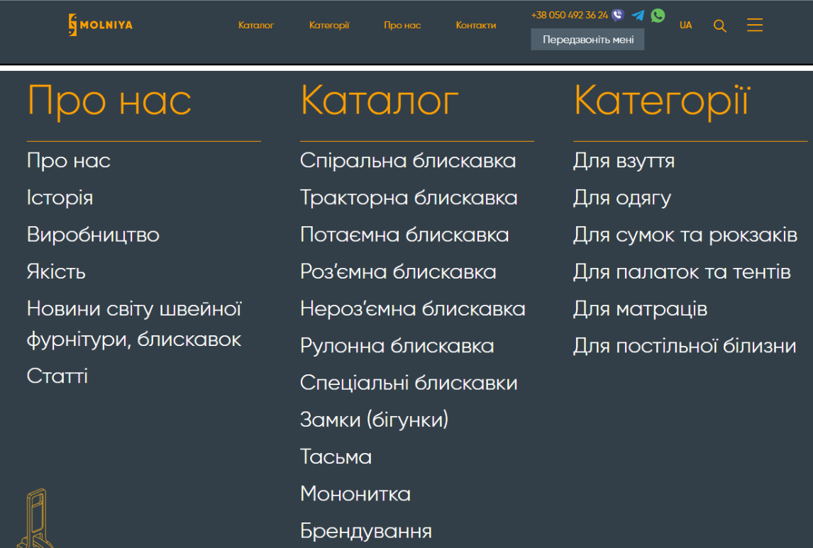
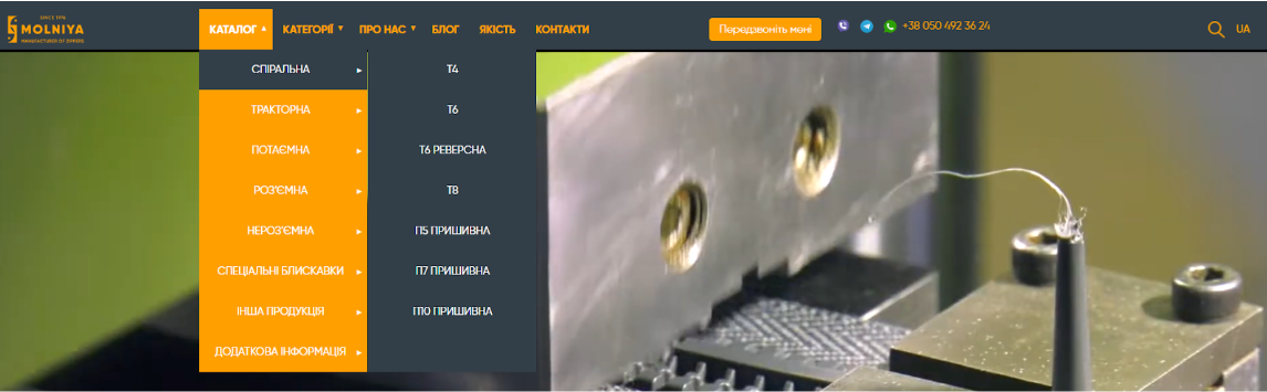
- Design for PC version: A layout of the website header without a burger menu was developed, with integrated main navigation items: “CATALOG”, “CATEGORIES”, “ABOUT US”, “BLOG”, “QUALITY”, “CONTACTS”, “CALL ME BACK”, as well as a contact phone number, search icon, and language selection. Special attention was paid to the development of the dropdown menu:
- Hover interaction: Implemented background change to orange on hover and main categories within it.
- Multi-level: Ensured the ability to expand submenus on hover over specific zipper types (e.g., “Special Zippers”), as well as clickability of both main categories and their sub-items for direct navigation to corresponding pages.
- Visual indicators: Implemented the display of arrows next to menu items that have subcategories, appearing only if corresponding elements are present in the admin panel.
Before:
After:
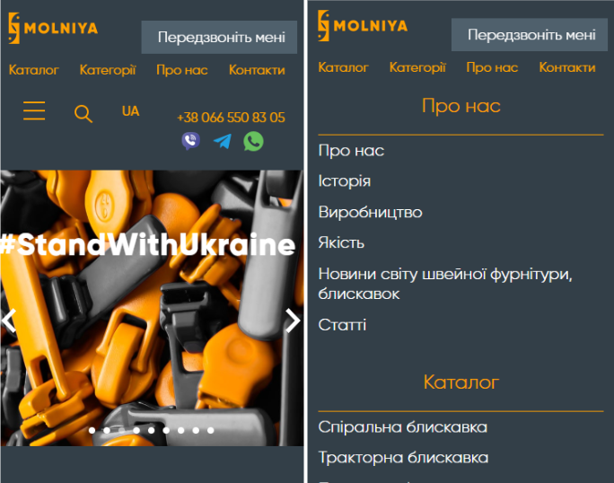
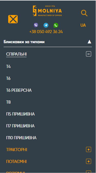
- Design for mobile version: For mobile devices, a simplified but functional interface was developed, ensuring ease of use on small screens. Instead of hovering, clicking became the primary interaction.
- Expand/Collapse: Clicking on a category (e.g., “Coil Zipper”) or the “+” icon next to it expands the sub-items.
- Two-step transition: Implemented functionality where the first click on a category expands sub-items, and the second click (on the same category) navigates to the corresponding page. If there are no sub-items, the transition occurs on the first click.
- Visual state indication: The “+” icon changes to “–” when the menu is expanded, indicating the possibility of collapsing.
- Color change on activation: The background color changes when clicking on an element that opens a submenu, providing visual feedback.
Before:
After:
Stage 3: Software Implementation and Integration
At this stage, the direct development of the program code for implementing the new functionality was carried out.
- HTML/CSS/JavaScript: The HTML structure for the new menu was developed, styled using CSS, and interactive behavior was implemented using JavaScript. Modern approaches were used to ensure high performance and smooth animations.
- CMS Integration: A key point was the development of modules or configuration of existing CMS (content management system) components, allowing site administrators to easily add, edit, and delete menu items, as well as specify the presence of subcategories without involving programmers. This ensures complete autonomy in supporting and developing navigation.
- Testing: Comprehensive testing of the functionality was conducted on various devices and in different browsers to identify and eliminate possible errors and shortcomings. Testing included checking the correctness of display, response speed, clickability of all elements, and compliance with administrative panel requirements.
Stage 4: Deployment and Monitoring
After successful testing, the updated menu was deployed on the main websites molniya.com.ua and molniya.eu.com/de/. After deployment, monitoring was carried out to track user behavior and identify any unexpected problems or opportunities for further optimization.
 Result obtained