
 Input data
 Progress of work
With the growth of the e-commerce market and changing user preferences, it was decided to update the homepage to improve the user experience (UX) and increase conversion. The old version of the site, while functional, had a number of drawbacks: a non-interactive design, an unoptimized structure, and a lack of elements that would encourage purchases.
The redesign project aimed to comprehensively modernize the visual and structural aspects of the homepage, transforming it from a simple “shop window” into an effective sales tool.
Problems with the Old Homepage
An analysis of the old homepage revealed the following key shortcomings:
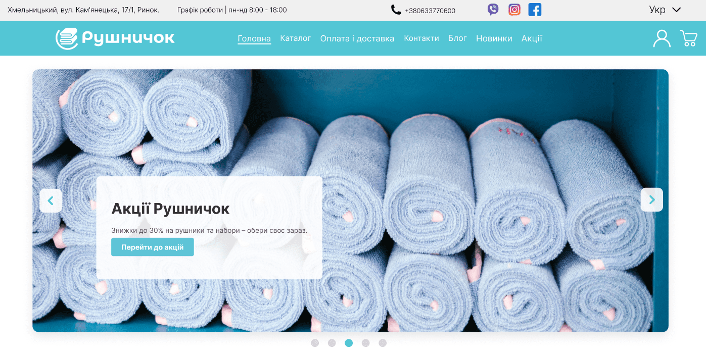
- “Dummy” Slider: A large slider occupied a significant portion of the first screen, but its images were not clickable and had no call to action (CTA). It served only a decorative function, without engaging the user in further interaction.
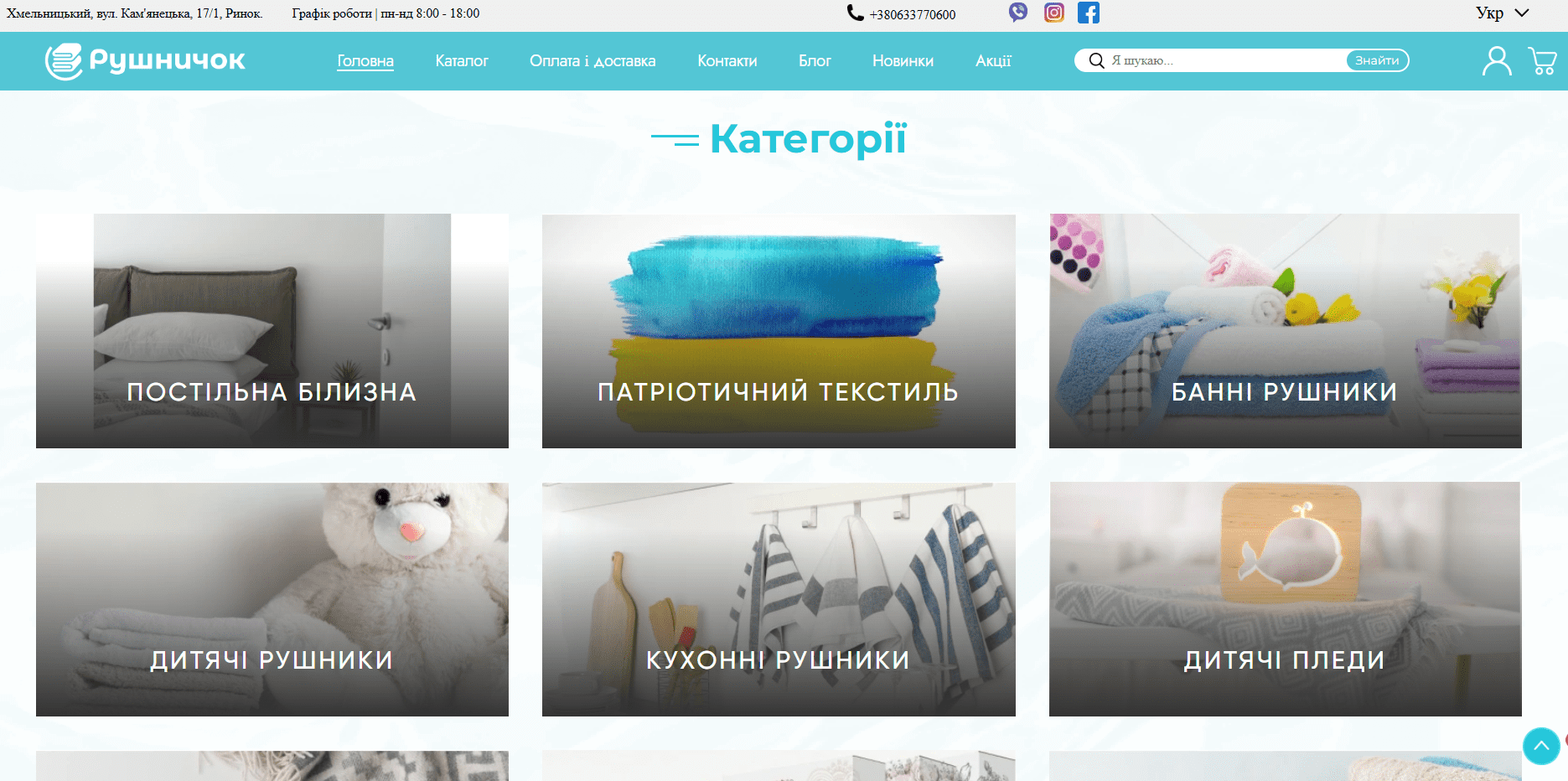
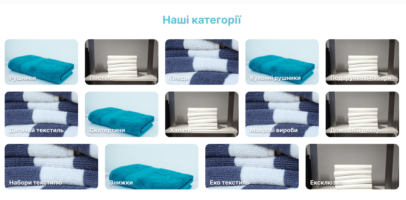
- Ineffective Category Presentation: The quick-access category block was visually unbalanced. The images were too large, forcing users to scroll down the page for a long time to see all the offers.
- Lack of Product Blocks: The homepage lacked blocks for popular, discounted, or new products. This prevented users from quickly seeing the store’s best offers and stimulated impulse buys.
- Weak Brand Positioning: There was no separate block highlighting the store’s advantages. This made it difficult to differentiate “Rushnychok” from competitors and build trust with potential clients.
- Lack of Social Proof: Reviews were either absent or presented in an unconvincing format, without a source to confirm their authenticity. This lowered the level of trust.
- Ineffective Content Presentation: The block with the latest articles was visually unappealing. Small images and unreadable text did not encourage users to visit the blog, even though it contained a lot of useful information.
Implementation and New Solutions
1. Main Slider Modernization
The old slider was completely redesigned. Instead of simple, non-clickable photos, it now features fully interactive blocks with text, vibrant images, and a clear call to action (CTA). Each slide now highlights a specific promotion, new collection, or key category, directing the user directly to the relevant page. This element has become not just a decoration but a powerful tool for navigation and conversion enhancement. For example, a slide can lead to a “Towel Sale” page, “New Towel Collection,” etc.
Before
After
2. Category Block Optimization
This block was retained, but its visual design was significantly improved. Image sizes were adjusted to be more compact while remaining informative. This allowed more categories to be placed within a single screen, which greatly improved viewing convenience and reduced the need for scrolling. Now, a user can evaluate the entire assortment in a matter of seconds and go to the desired section without wasting extra time.
Before
After
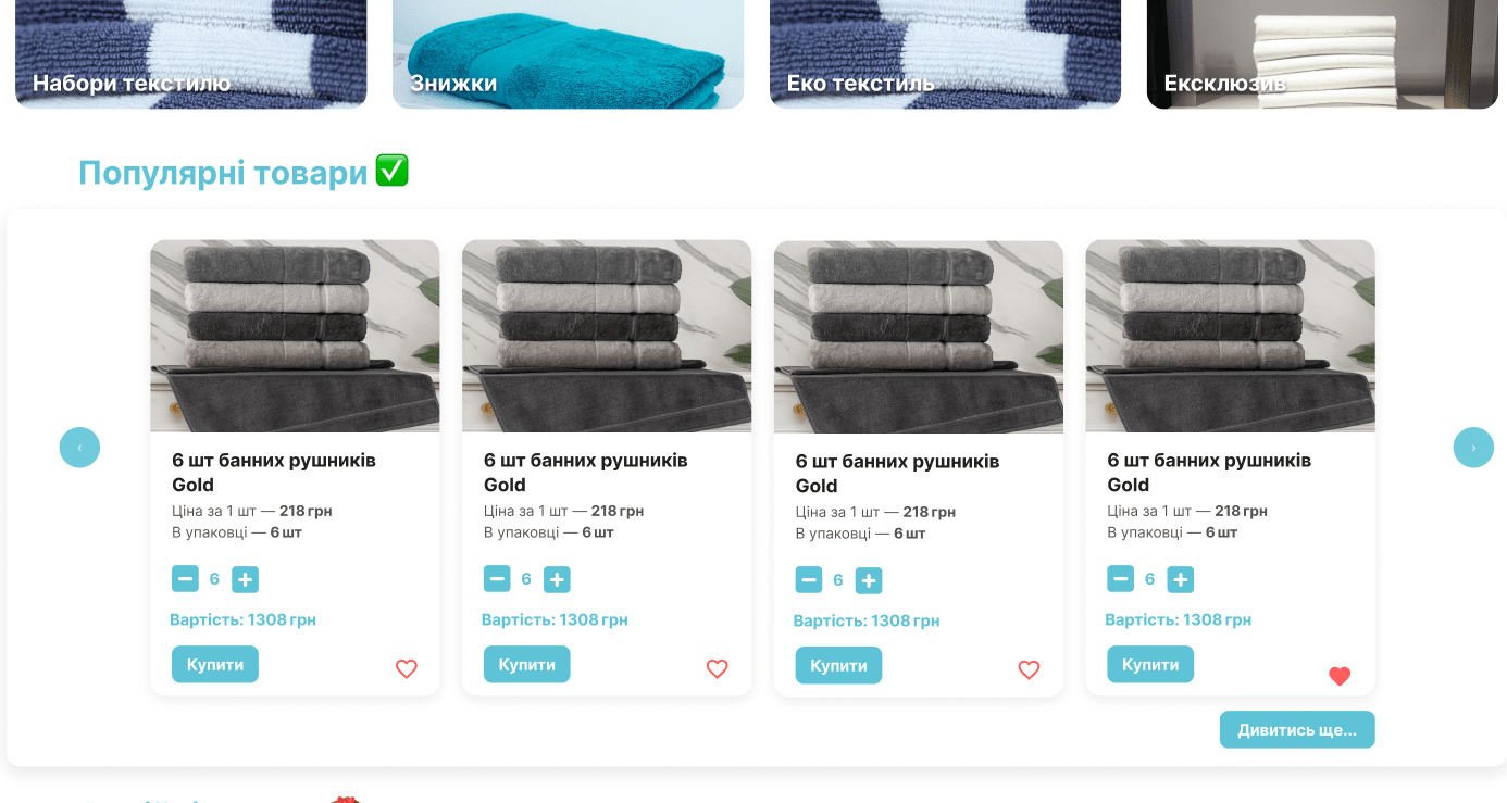
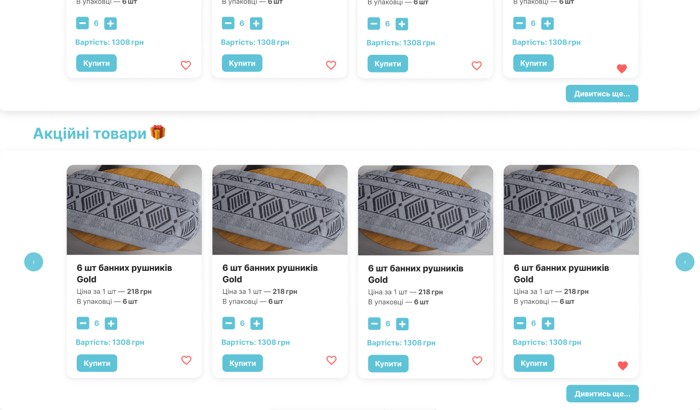
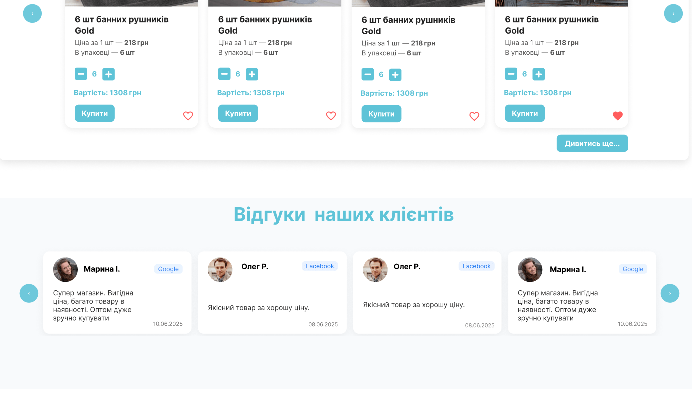
3. Adding Product Blocks
To stimulate sales and simplify the search, separate blocks for key product groups were added:
- “Popular Products”: This block shows the products that are in the highest demand. This serves as powerful social proof and encourages new clients to choose proven and popular items.
- “Promotional Products”: The block with discounted items creates a sense of urgency and value. It attracts “bargain hunters” and stimulates impulse purchases.
- “New Products”: This showcases the latest arrivals in the store, which is especially important for repeat customers looking for fresh offers.
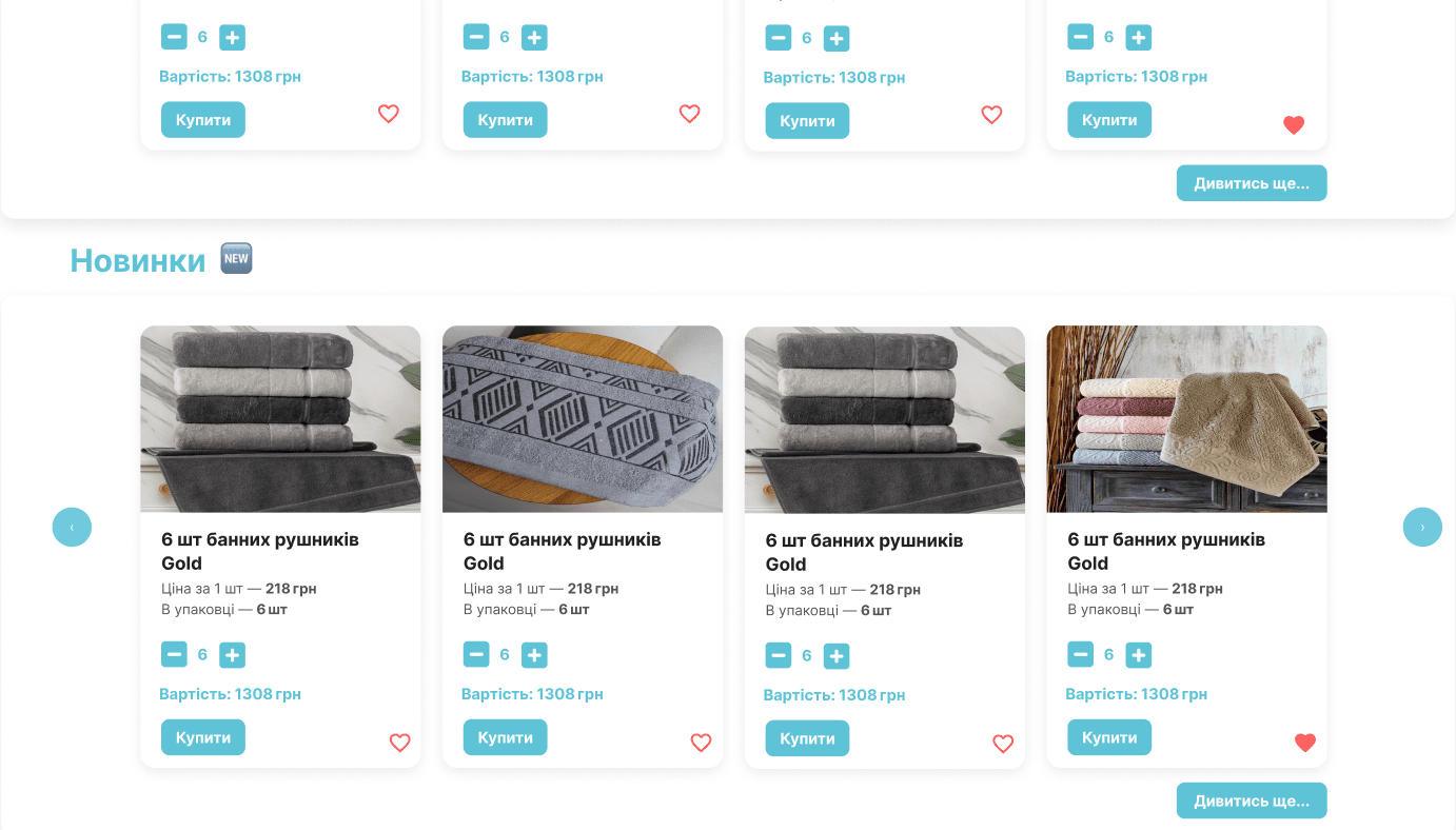
Each block contains a product photo, name, price, and a “Buy” button, which allows for a purchase without navigating to the product page. This significantly speeds up the checkout process.
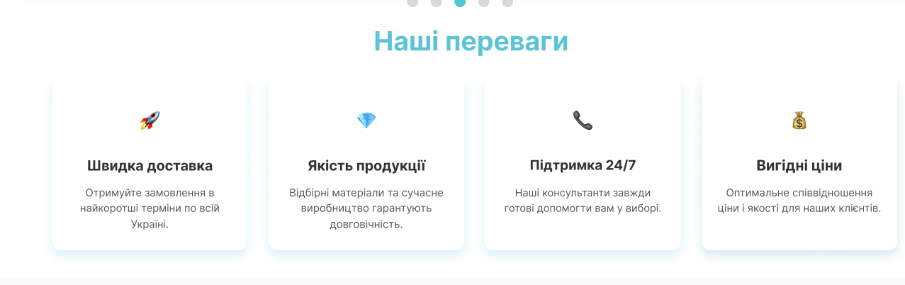
4. “Our Advantages” Block
To emphasize the store’s uniqueness and increase trust, a separate block was created to talk about “Rushnichok’s” advantages. These could include points like “Fast Delivery,” “Handmade Embroidery,” “Quality Materials,” “Custom Orders,” and “24/7 Support.” Each advantage is accompanied by an icon and a brief description, making the information easy to digest. This block helps convince visitors they are making the right choice by selecting this particular store.
5. Interactive “Reviews” Block
A reviews block was added, which can be a powerful tool for building trust. Each review is accompanied not only by text and the author’s name but also shows the source—for example, a link to a review on Google Maps, Facebook, or Instagram. This approach ensures authenticity and credibility, which significantly boosts the trust of potential clients. Reviews are no longer just text but social proof that the store operates honestly and has satisfied customers.
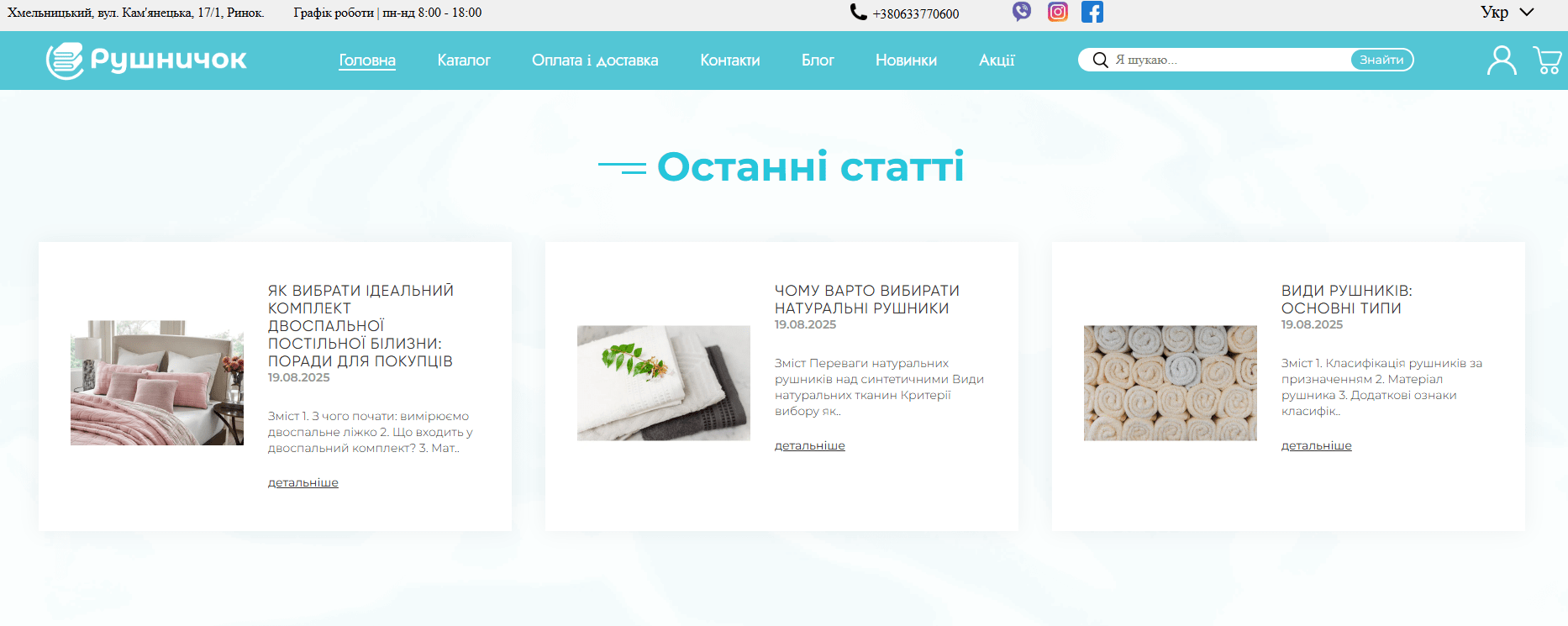
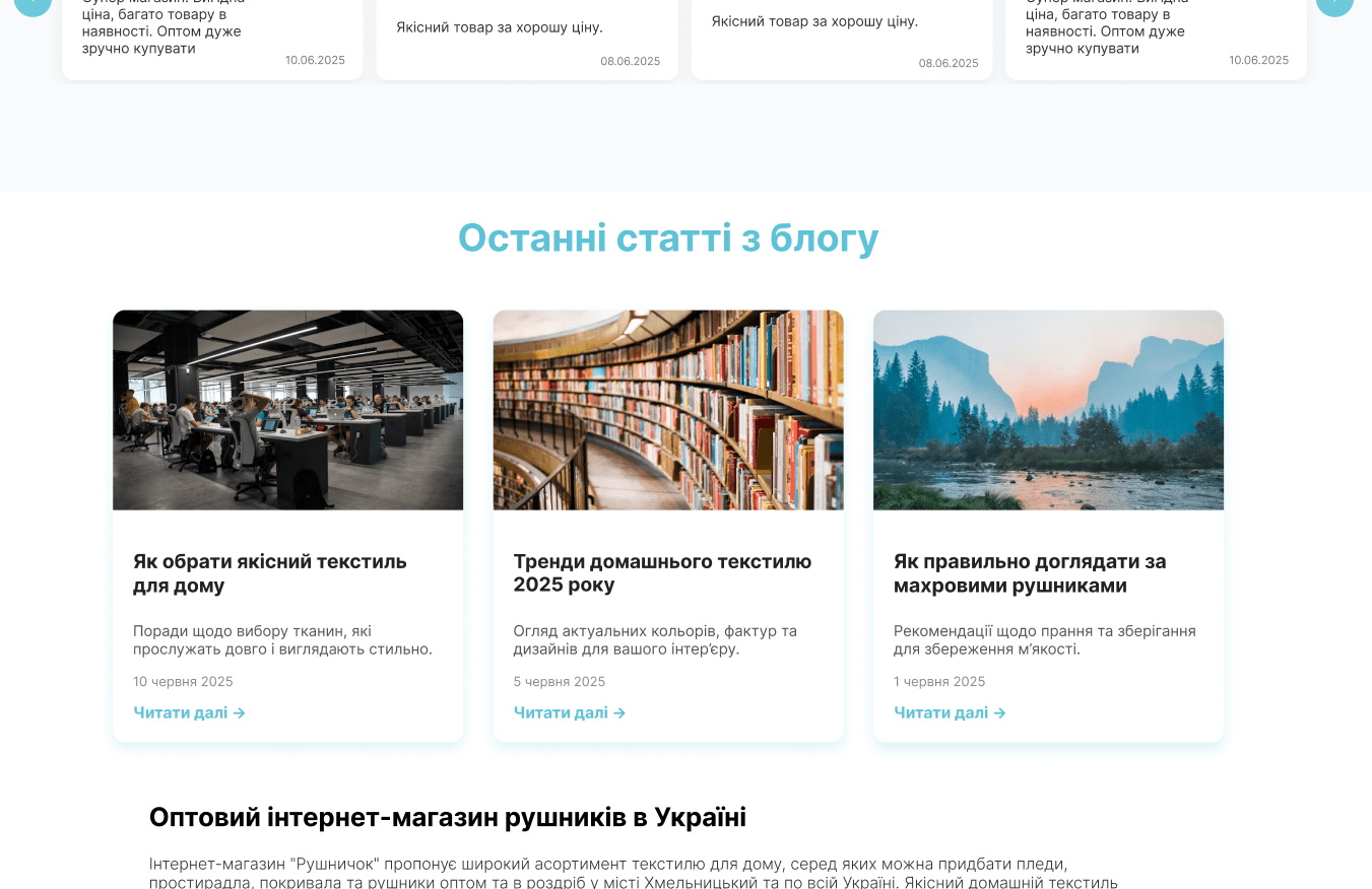
6. “Latest Articles” Block Modernization
Content marketing is an important part of the “Rushnichok” strategy, so the latest articles block was updated. The size of the preview photos was increased, making them more visually appealing. The introductory text now has a larger font and better formatting, which improves its readability. This block now not only informs but also encourages users to dive into the content, which helps build brand loyalty and positions the store as an expert in its niche.
Before
After
 The result obtained


