 Input data
 Progress of work
Working on the task of making the homepage design more attractive and conversion-oriented, we focused on several key aspects that, together, would create a holistic and effective visual and functional solution.
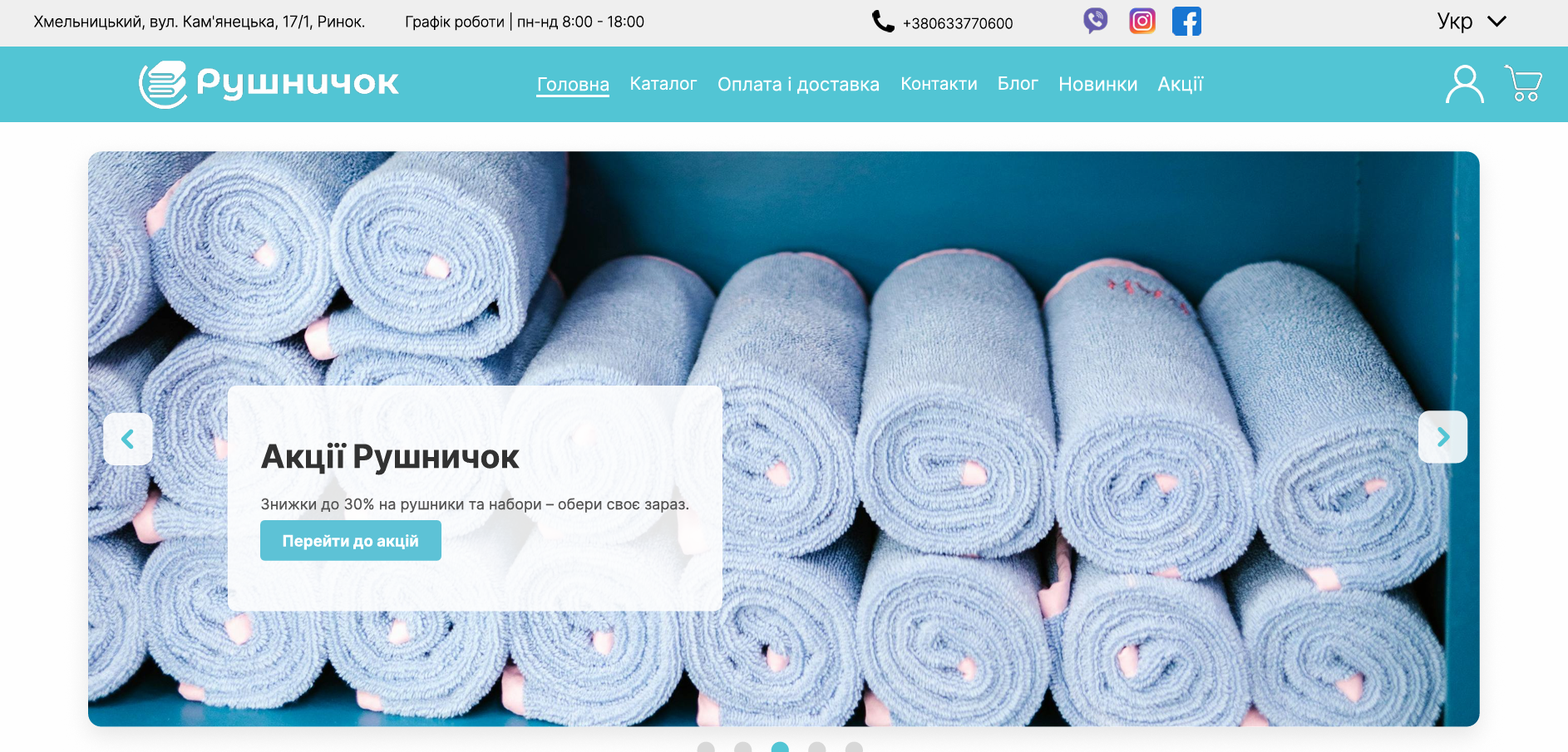
1. Slider on the first screen: First of all, we paid attention to the first screen of the site. To create a “wow” effect and quickly attract user attention, we improved the slider. Its goal is not just to show beautiful pictures, but to instantly convey the most relevant and advantageous offers, such as promotions or new arrivals. A clear heading, a short description of the benefit, and a bright call-to-action button are precisely those elements that should encourage further exploration of the site.
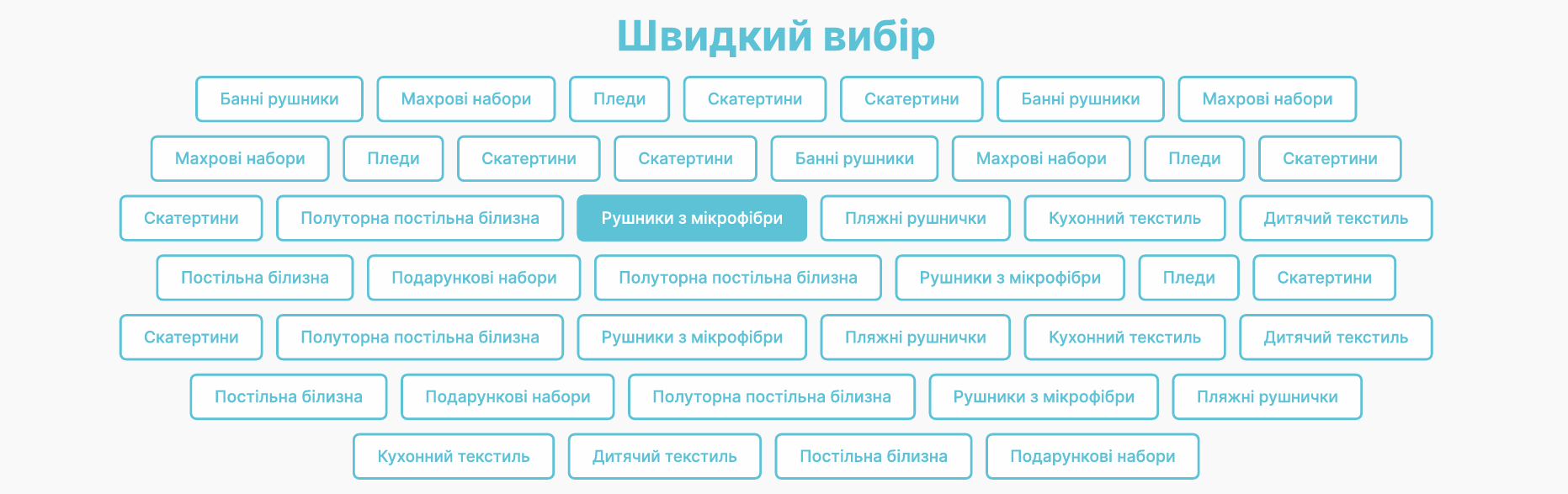
2. Quick category selection: Next, we understood that the user needed quick and convenient access to the main product groups. Therefore, we created a “Quick Selection” block, where the most popular categories are presented in the form of compact buttons. This allows the visitor to instantly navigate to the desired section without wasting time searching in the menu.
3. Categories with photos: To visually enhance navigation and provide more context, we developed a “Our Categories” section with photographs. Instead of a simple list, each category is represented by an attractive card with an image, immediately giving an idea of the assortment. This is not only aesthetic but also helps to orient oneself more quickly.

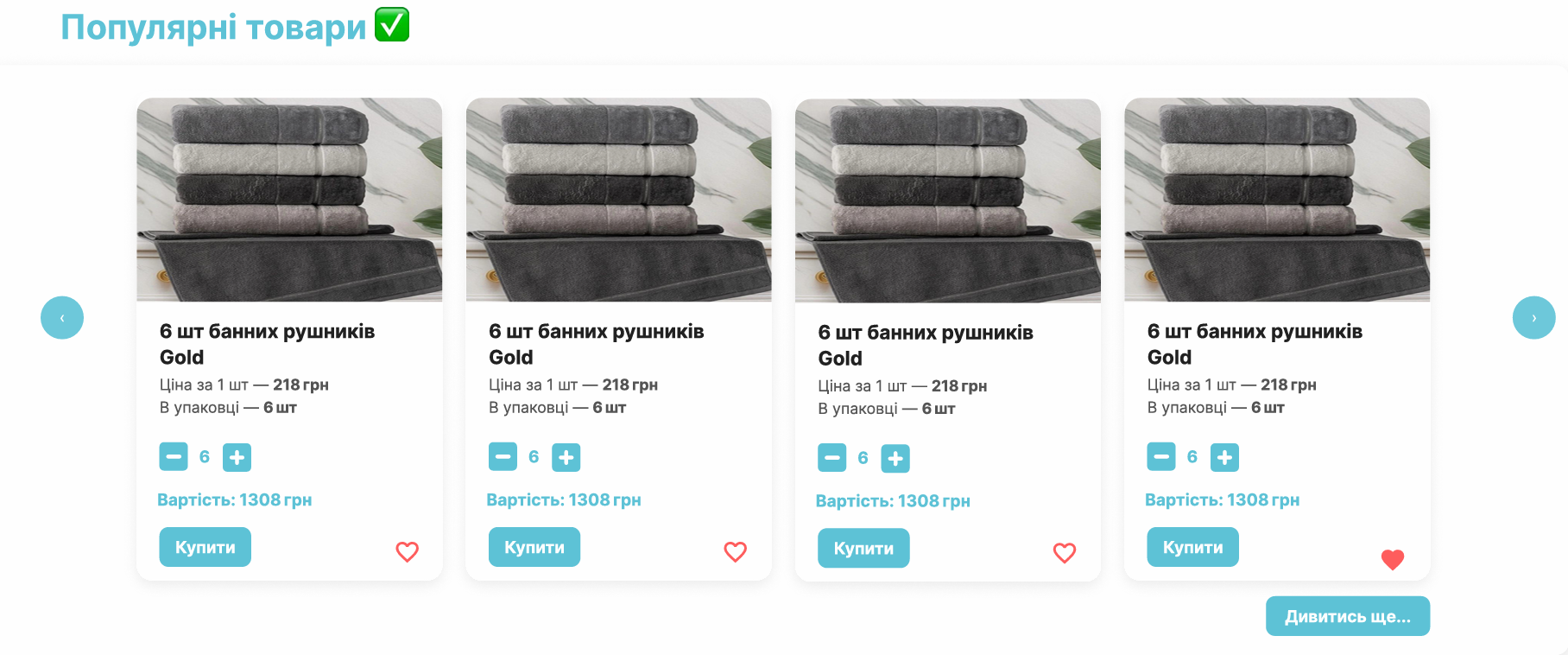
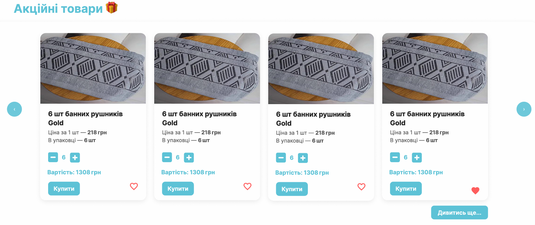
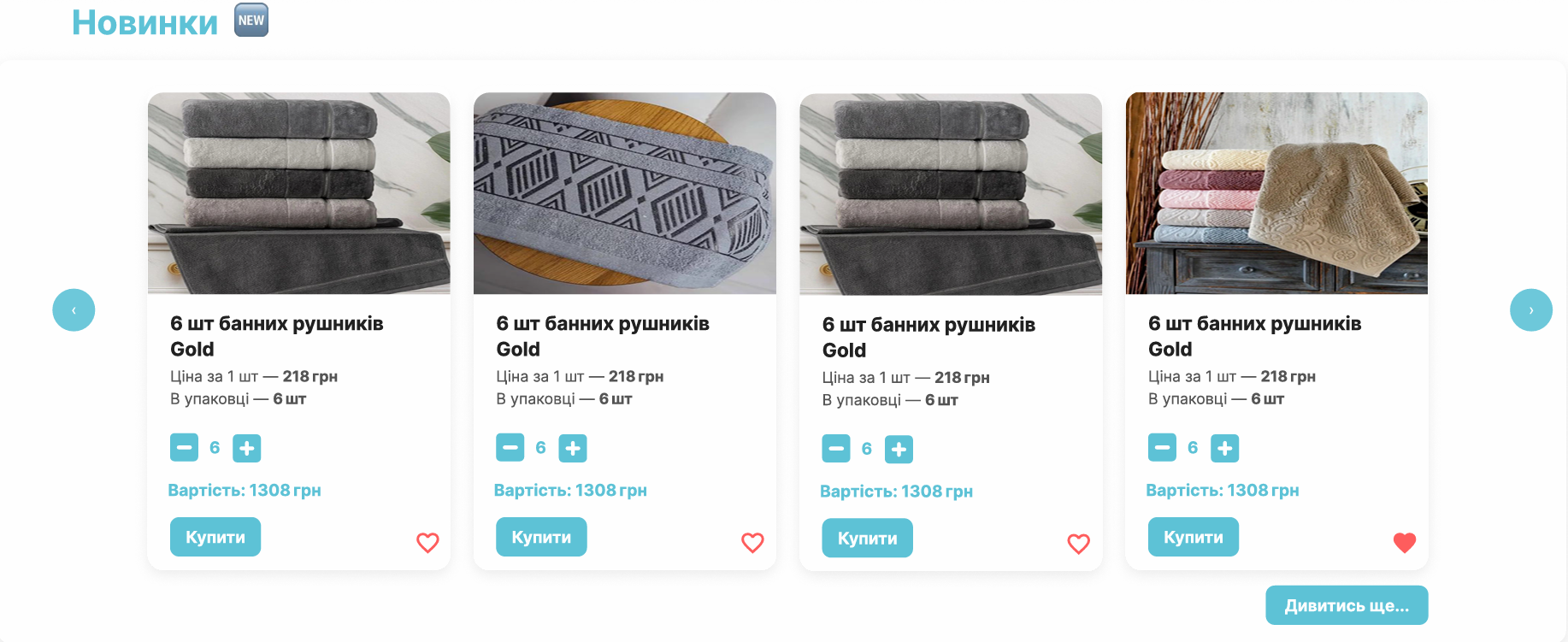
4. Popular, promotional items, and new arrivals: To increase conversion and demonstrate the popularity of products, we highlighted special blocks: “Popular Products,” “Promotional Products,” and “New Arrivals.” Each of these blocks allows for a quick acquaintance with the most interesting offers that may be relevant to a wide range of buyers. Each product card contains key information and a clear “Buy” button, simplifying the ordering process. Horizontal scrolling provides convenient viewing of a large number of items.
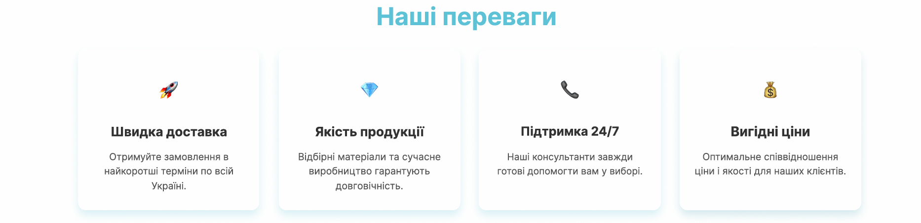
5. Our advantages: An important step in building trust and demonstrating the company’s value was the creation of the “Our Advantages” block. Here, we concisely conveyed the key benefits of cooperation using icons and short bullet points – from fast delivery to favorable prices. This helps a potential client understand why they should choose “Rushnychok.”
6. Our clients’ reviews: For social proof and strengthening a positive image, we integrated the “Our Clients’ Reviews” section. Real reviews with links to sources (Google, Facebook) add credibility and show that the company values its customers’ opinions.

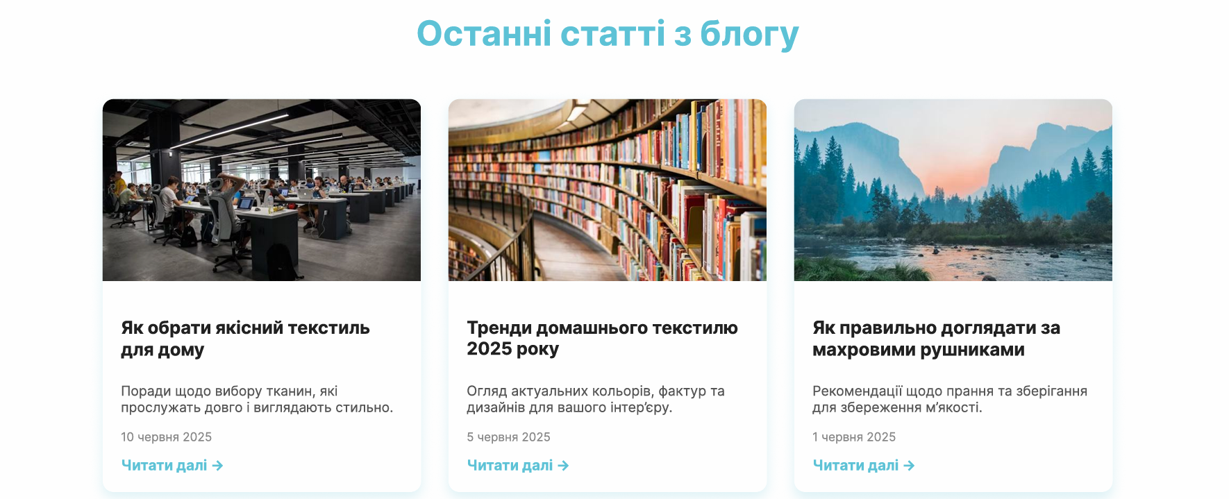
7. Latest blog articles: Finally, to maintain visitor interest and demonstrate the company’s expertise, we added a “Latest Blog Articles” block. This not only allows sharing useful information (e.g., tips on choosing textiles or caring for them) but also increases the user’s time spent on the site, which positively impacts SEO and overall interaction.
All these steps were aimed at making “Rushnychok’s” homepage not just a storefront, but an effective tool for attracting clients and stimulating sales.
 The result obtained


