 Input data
 Progress of work
Within our project to improve the Bilyk Ultra Laser website, we faced the task of fundamentally changing the approach to presenting information, transforming the resource from a simple online directory into a full-fledged, convenient, and attractive tool for users. The entire process can be divided into several key stages, each of which was aimed at solving specific problems, which ultimately should lead to the creation of a holistic, modern, and functional website.
First Stage: Updating the Overall Structure and Design of Service Categories
Our first step was a complete rethinking of how the user interacts with the service catalog. Previously, this section was quite static and not always intuitively clear. We decided to move away from the standard display model and create a more dynamic and informative structure. This was a key moment for improving the UI (user interface).
We started by updating the service display tile. Instead of the usual image with a small amount of text, we introduced a new design that includes more aesthetic and informative photos of the services and their subcategories. This decision allowed users to visually assess the essence of the procedure even before they navigate to the corresponding page, which significantly accelerated the search for necessary information. This change directly contributed to improving UX (user experience).
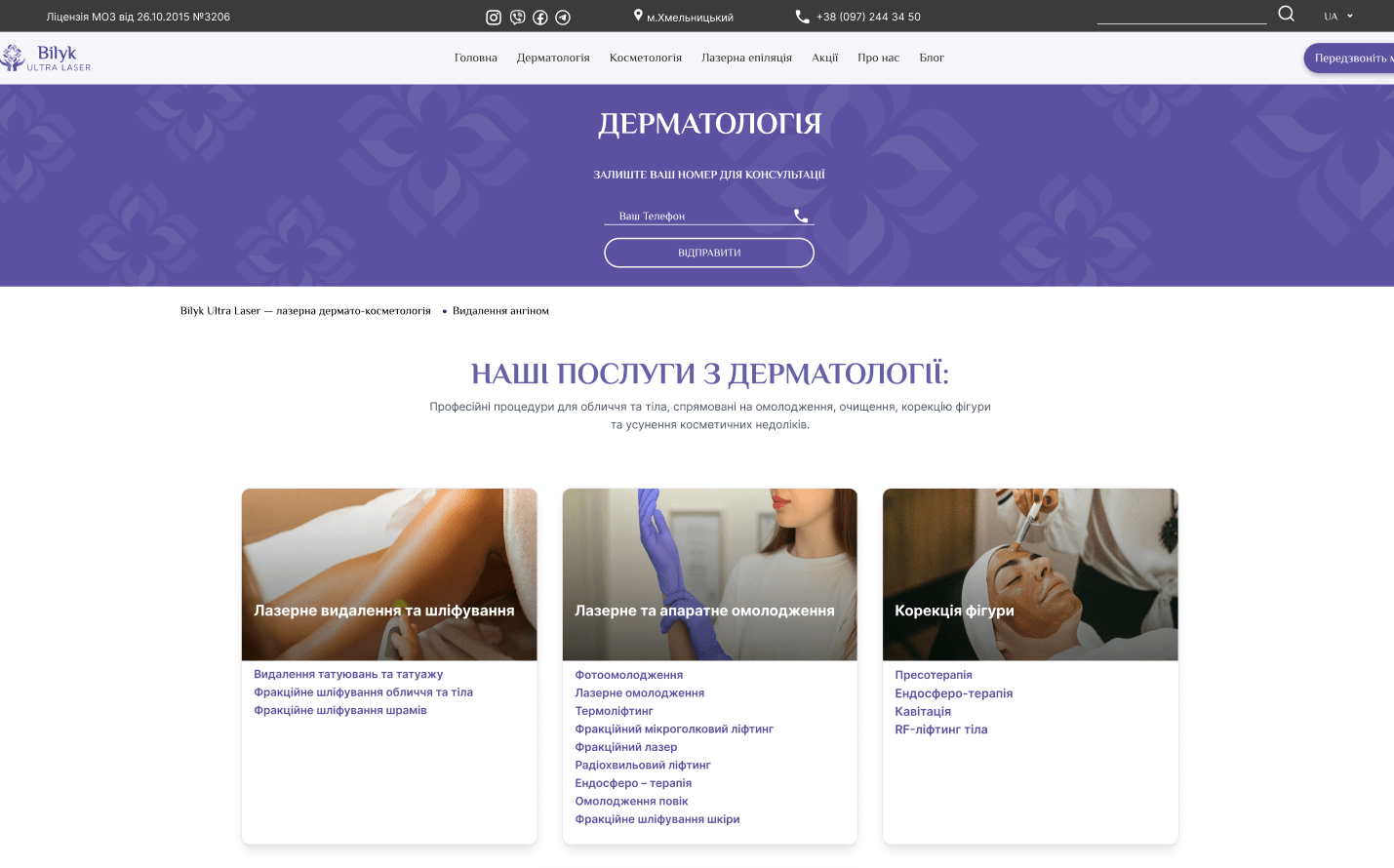
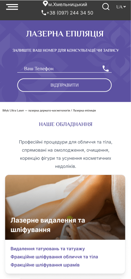
Figure 1 — general services page
Next, understanding how important information about technology and personnel is to clients, we added a unique block with details about equipment and doctors. On each general service category page, you can now see exactly which devices are used for a particular procedure and get acquainted with the specialists who perform them. This added transparency and increased trust in the clinic, which is part of the overall improvement of the user experience.
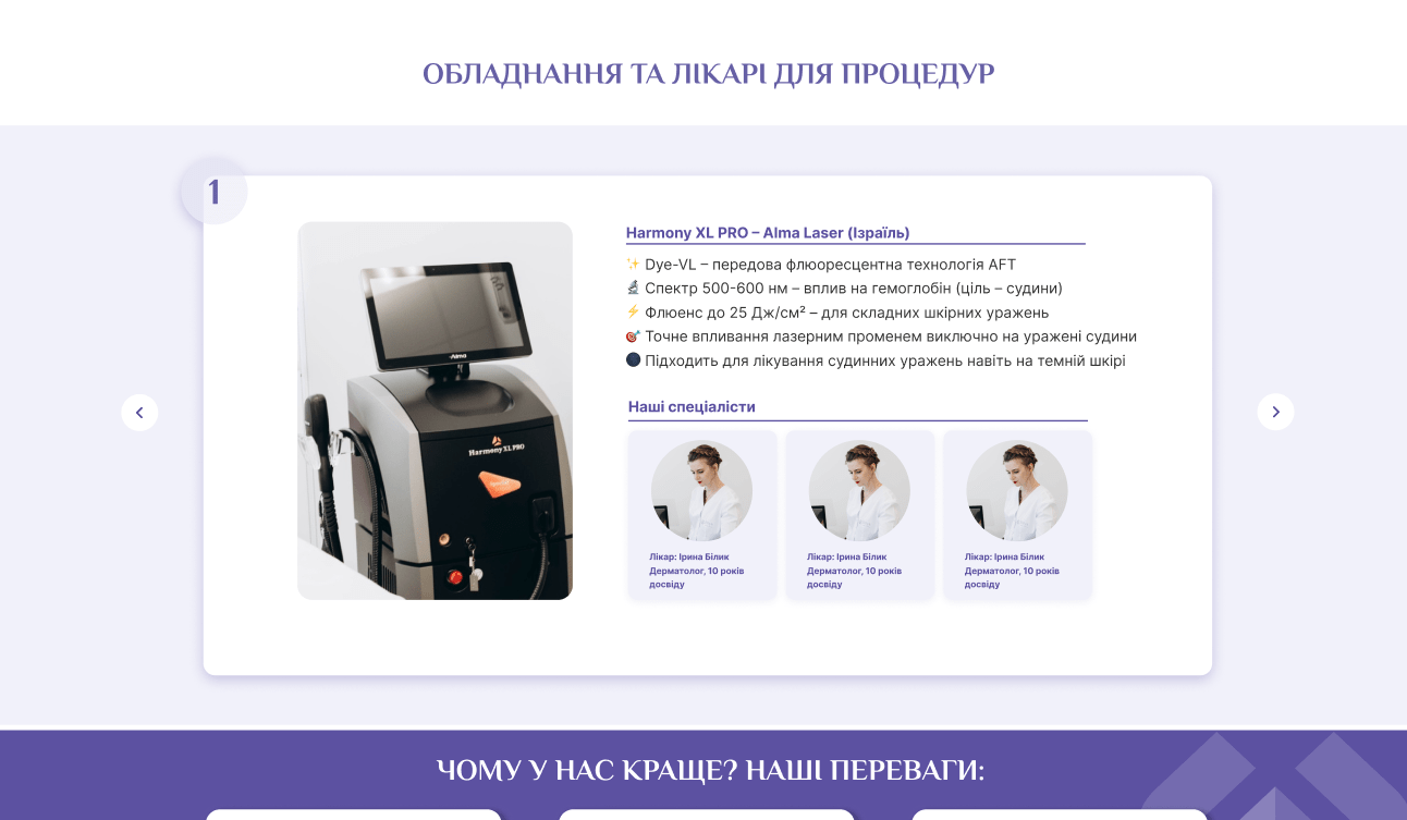
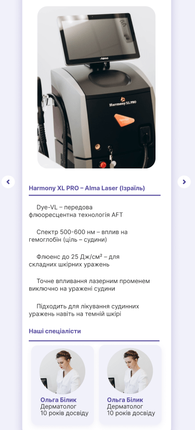
Figure 2 — equipment and doctors
A significant element was also the redesigned block with advantages. Instead of a simple list, we created a visually appealing section where the key advantages of the center are described in a brief and concise form.
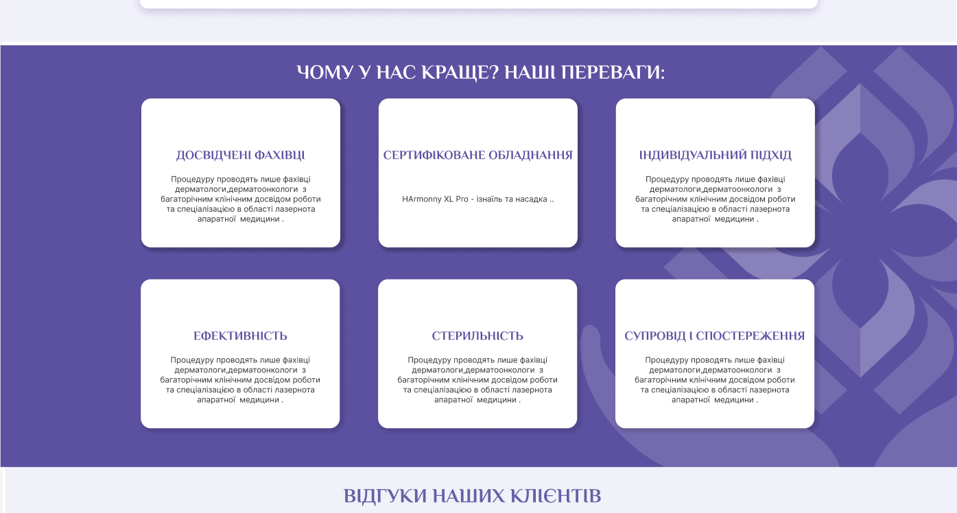
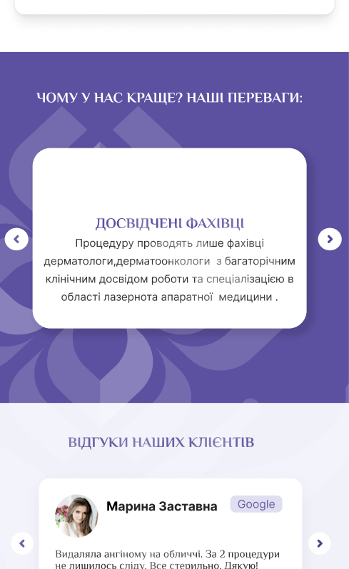
Figure 3 — advantages
We understood that real reviews are one of the most powerful tools for attracting new clients. Therefore, we added a review block where real opinions and impressions of patients are collected.
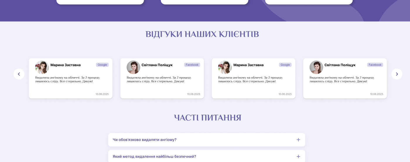
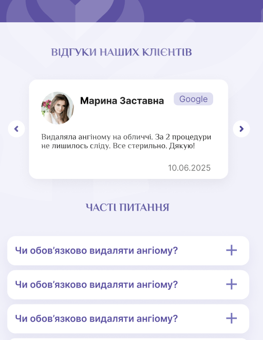
Figure 4 — reviews
Finally, we implemented a block with frequently asked questions. This allowed us to pre-emptively answer the most common client inquiries, which reduces the workload on administrators and increases the overall informative value of the site.
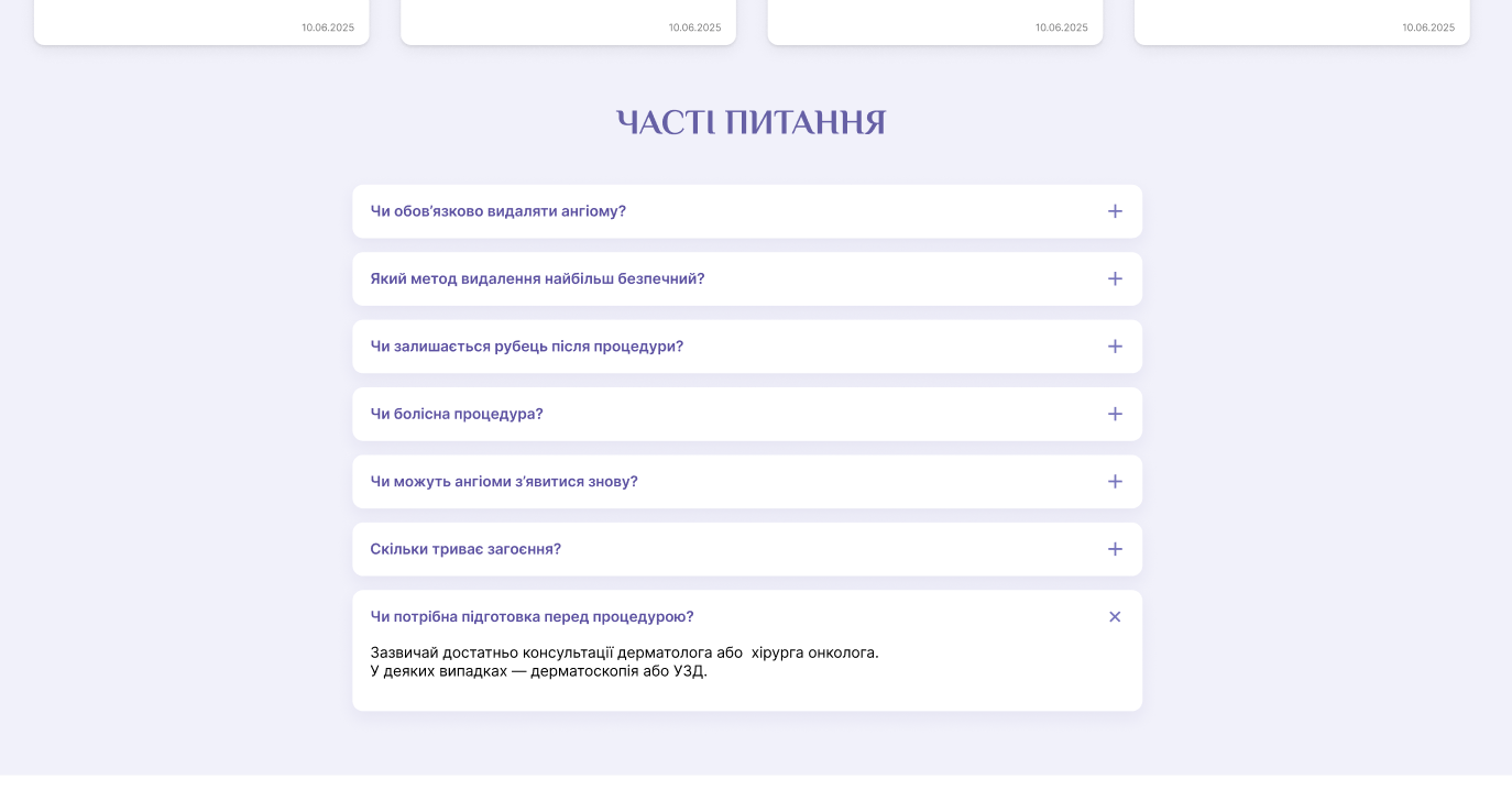
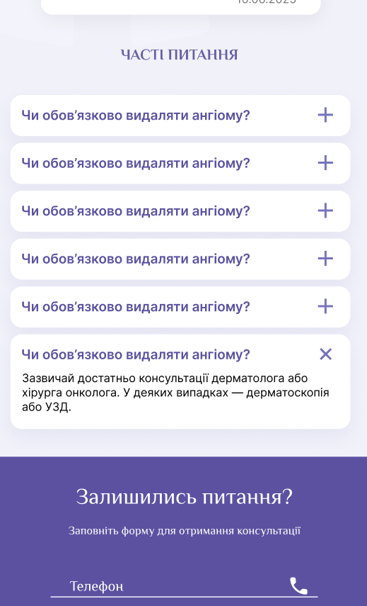
Figure 5 — frequently asked questions
All these changes were integrated into a unified, harmonious structure that was adapted for both the desktop version and mobile devices. This ensured comfortable use of the site regardless of the device the user visits it from.
Second Stage: Reworking Service Pages
Perhaps the most important stage of our work was the complete rethinking of the structure of the service pages. Previously, they were presented as dry, monotonous text, which was inconvenient to perceive. Our goal was to transform these pages into full-fledged, informative, and visually appealing resources. This was aimed at a comprehensive improvement of UI/UX.
We started by giving each service page a logical and consistent structure. First, we placed brief information about the disease or problem that the procedure solves.
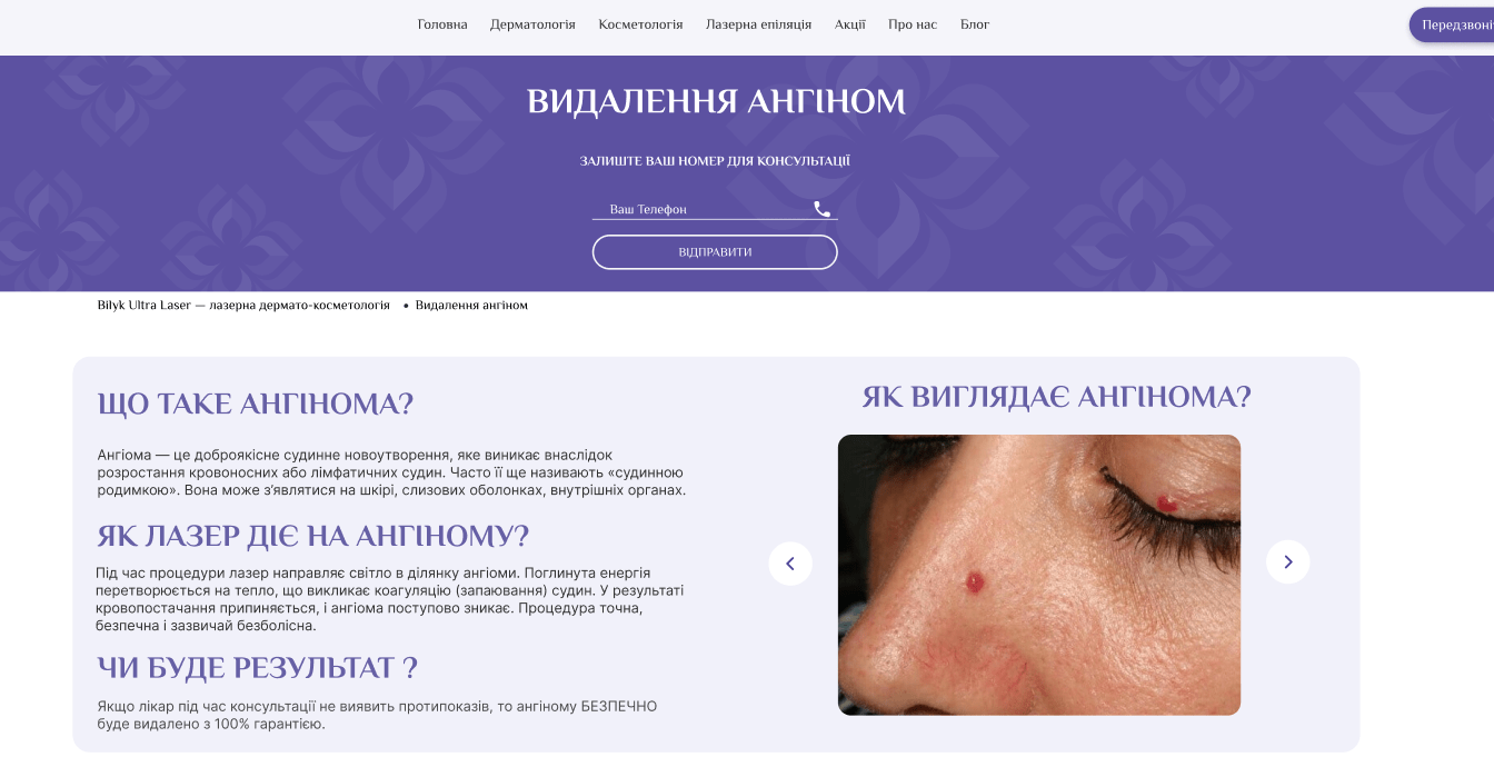
Figure 6 — information about the disease
Next came the “How does the procedure work?” block. We described each step in detail but accessibly, which helped clients imagine the process and reduce possible fear of the unknown.
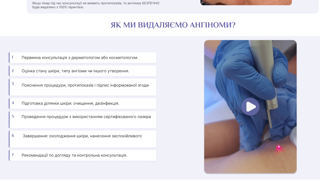
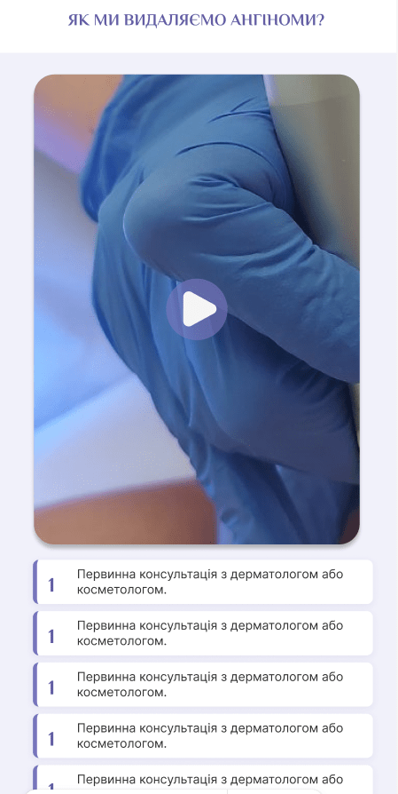
Figure 7 — how the procedure works
The next element was the results block. We showed what to expect after undergoing the procedure.
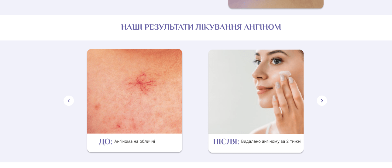
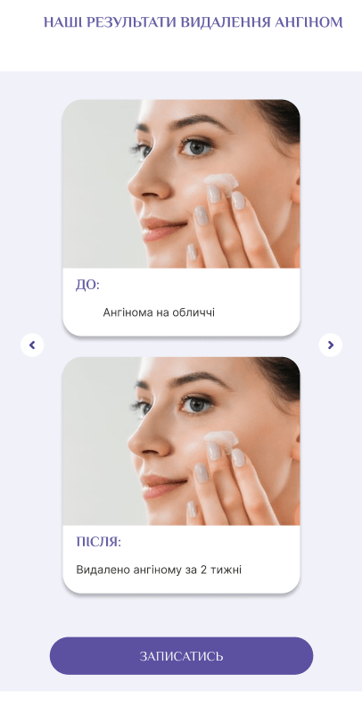
Figure 8 — procedure result
Next, we placed more detailed information about the procedure itself, its mechanisms of action, duration, and other important nuances.
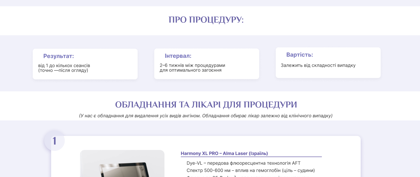
Figure 9 — about the procedure
The next step was to duplicate the block with equipment and doctors, but this time with an emphasis on a specific service.
To ensure client safety and awareness, we added a block with contraindications.
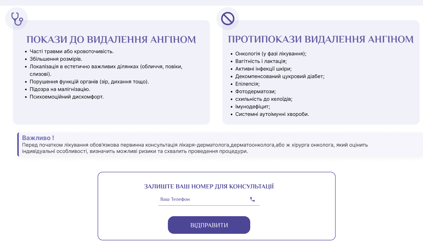
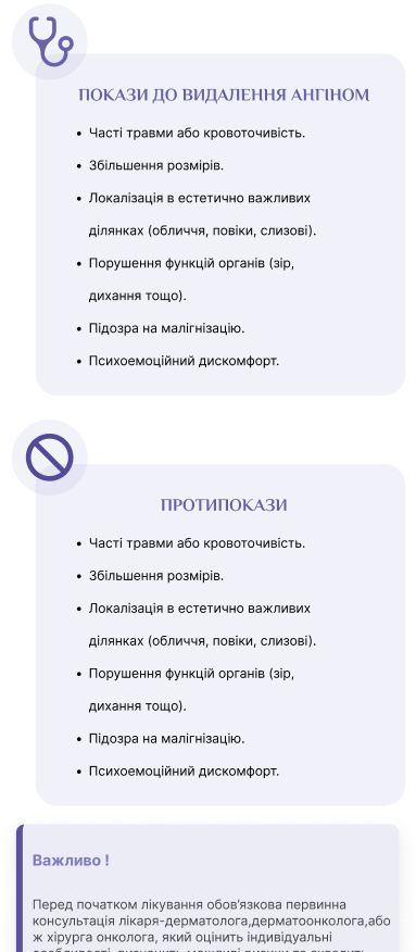
Figure 10 — contraindications
We once again integrated the block with our advantages, but this time taking into account the specifics of the particular service.
The page ended with our familiar blocks: reviews and frequently asked questions which once again emphasized our openness and readiness to answer all questions.
 Result obtained


