 Input data
 Progress of work
The product card is the “face” of the product and a key decision-making point for the user. In the home textile niche, where emotional perception and clear specifications play a decisive role, interface convenience directly converts into profit. If a client cannot quickly find the price, understand wholesale terms, or examine the fabric texture, they leave the site. The redesign for “Rushnichok” aimed to eliminate these barriers and make the user’s journey to purchase as short and pleasant as possible.
The update process began with a deep audit of the old design. The analysis revealed several critical issues: an outdated visual hierarchy, suboptimal use of space, and a lack of emphasis on important marketing triggers (for example, promotional offers).
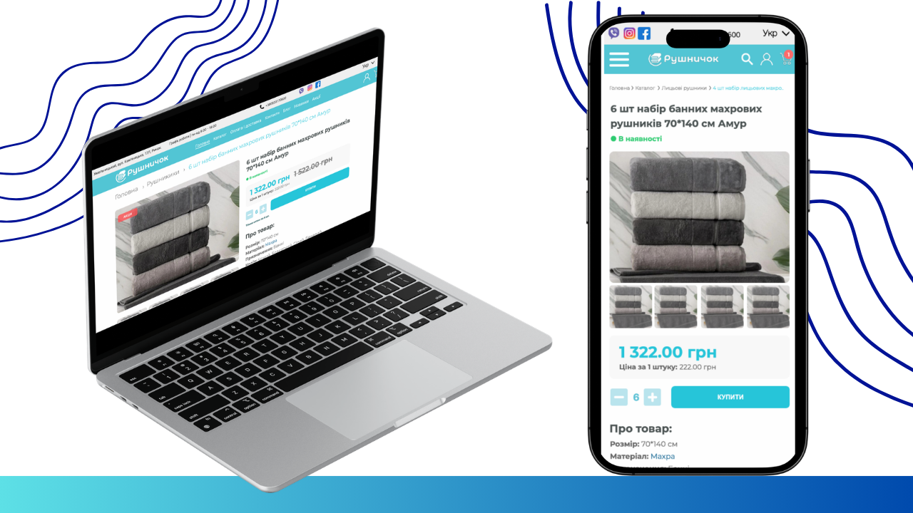
Old version of the product card
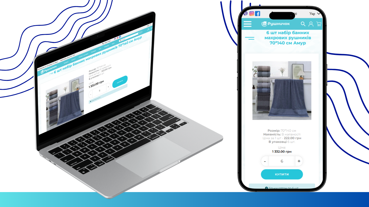
1. Visual Style Overhaul (PC and Mobile)
In the old version, the heading took up too much space, and information was scattered.
- Desktop Version (PC): We changed the heading hierarchy, making it more compact and adding “breadcrumbs” for convenient navigation. The price block received a light gray background, separating commercial information from the description.
- Mobile Version: The heading is now placed above the main photo, allowing the user to immediately identify the product when the page loads.
- Gallery Modernization (PC and Mobile)
The old version only featured one static photo.
- Desktop Version (PC): A thumbnail strip appeared under the main photo. This allows the client to switch between different angles and colors of towels in a set without closing the main window.
- Mobile Version: A preview image block was added under the main photo, which significantly improves UX on small screens, where previously only one static image was available.
3. Functional Characteristics (PC and Mobile)
We completely changed the presentation of technical product information.
- Interactive Internal Linking: Now, important parameters such as “Material: Terry” are active links. This allows the buyer to jump to a catalog of all products made from the same material with one click.
- Structured Block: In the “About Product” section, we divided characteristics into names and values. This makes it easier to compare parameters (size, purpose, color).
4. Color Availability Indicator and Action Buttons
We moved away from the text format for status in favor of visual signals.
- Indicator: Instead of an inconspicuous “In stock” label, a bright green dot marker was implemented. This allows for an instant understanding of the product status without reading.
- Button Composition (Mobile): Specifically in the mobile version, the quantity selection elements and the “Buy” button are now aligned in a single horizontal line. This saves screen space and creates a convenient zone for thumb interaction.
- Composition (PC): Control elements (quantity and button) are located sequentially under the price, maintaining the logic of vertical information scanning.
 The result obtained