 Input data
 The Importance of Website Design in Modern Business
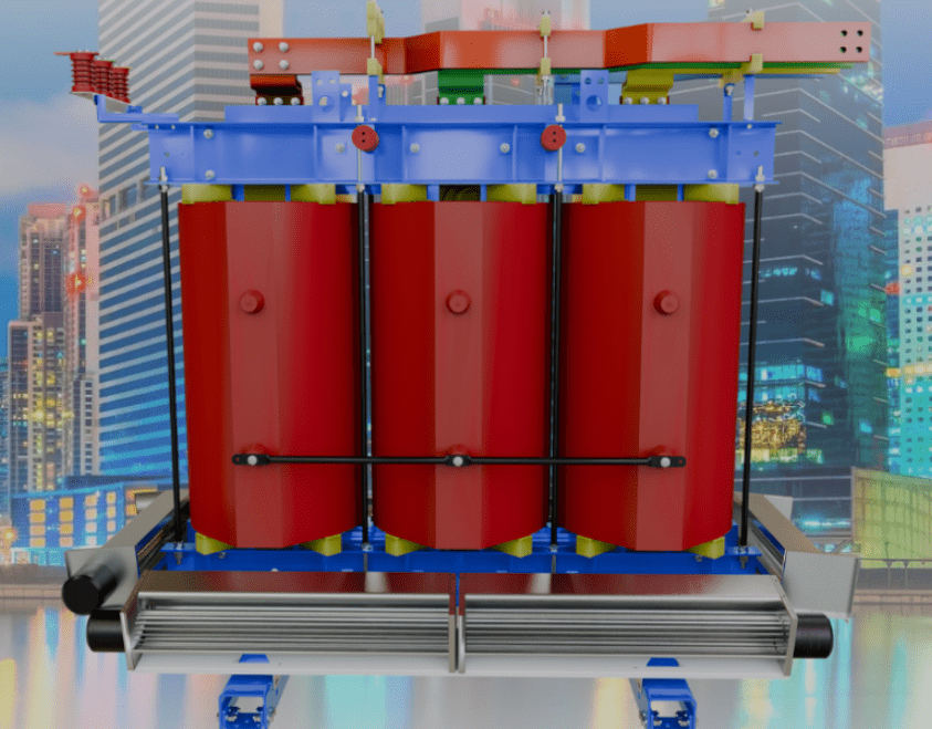
For a large manufacturing enterprise like “Ukrelektroaparat,” which specializes in transformer equipment, the website is a key tool for interacting with business partners, industrial clients, and potential customers. It serves not only as a product catalog but also as a channel for shaping the brand image associated with reliability, innovation, and professionalism.
An outdated design, inconvenient navigation, or an excessive amount of information can deter a visitor in a matter of seconds. Even the highest-quality products can go unnoticed if the path to them on the website is too complicated. Acknowledging this challenge, the management of “Ukrelektroaparat” approached us with a request for a website redesign. The main goal was not just to refresh the visual style, but to create an intuitive, functional, and modern resource that would underscore the company’s status as an industry leader.
A properly designed website that considers the latest UX/UI trends helps to:
- Increase Conversion: An intuitive interface and logical page structure simplify the customer’s journey from product acquaintance to making an inquiry or contact.
- Boost Trust: Modern design forms a positive brand perception, associating it with innovation, reliability, and customer care.
- Improve User Experience (UX): Easy navigation and quick information retrieval make interacting with the website pleasant and efficient.
- Optimize SEO Performance: Clean code, responsive design, and a logical site structure positively affect its ranking in search engines, ensuring visibility to new clients.
Workflow
The client approached us with a request for a website redesign because the outdated look and inconvenient functionality no longer matched the company’s scale and image. We took on this project with the goal of transforming the outdated resource into a modern, visually appealing, and maximally user-friendly business tool.
1. General Changes and Improvements
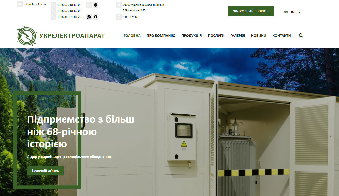
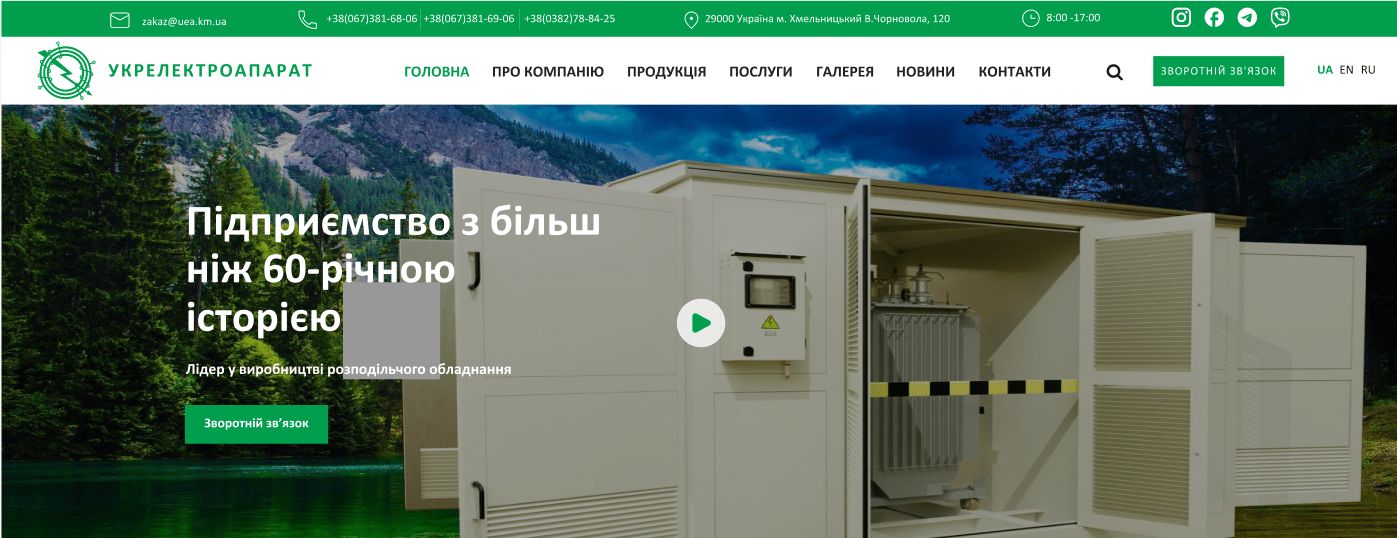
- Color Scheme: One of the first steps was the decision to change the website’s main color to a lighter one. Previously, dark shades dominated, making the site somewhat gloomy and visually heavy. The shift to a lighter palette not only refreshed the appearance but also made the visual space cleaner and lighter, easing information perception and giving the site a modern look that meets high professional standards.
Before
After
- Footer Cleanup: Unnecessary, irrelevant pages were removed from the website’s footer, which improved navigation and made the site appear “cleaner.” The footer now contains only the most essential information and links, without distracting the user.
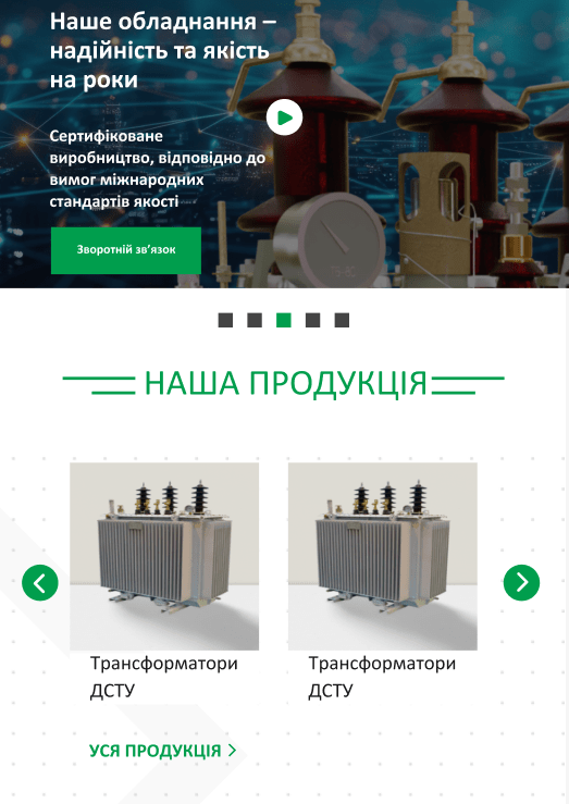
2. Homepage Optimization
The homepage is the face of the website that forms the first impression, so we paid special attention to it.
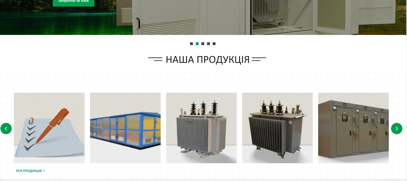
- Product Display: The overall product display was slightly changed for more intuitive and convenient user navigation. The mobile version underwent tangible changes—categories no longer take up much space without increasing the page size.
Before
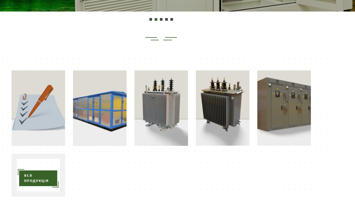
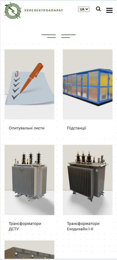
After
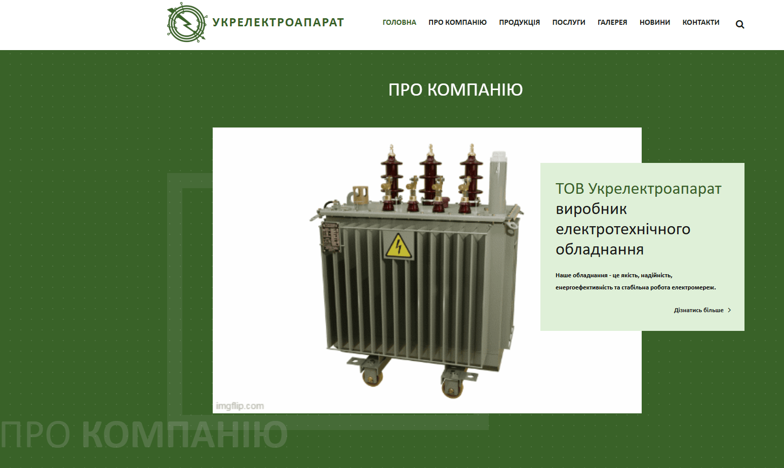
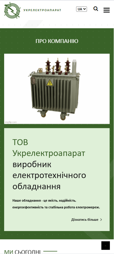
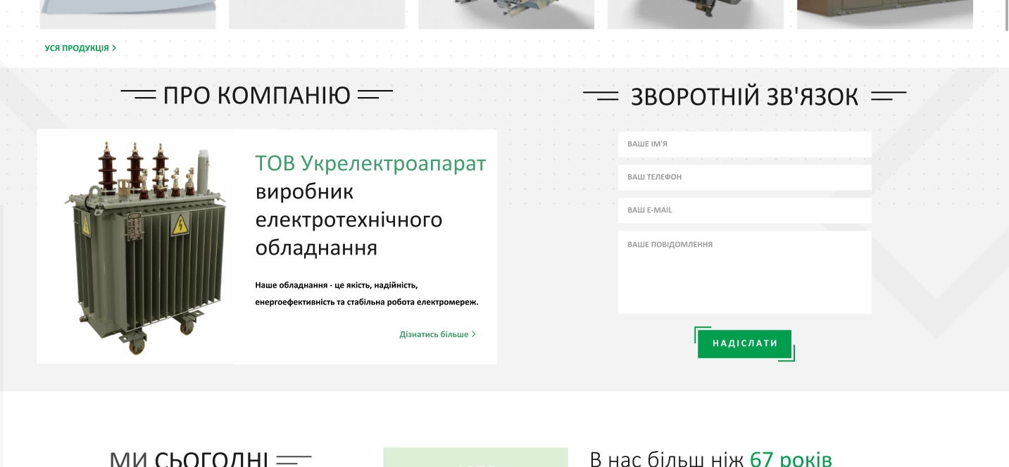
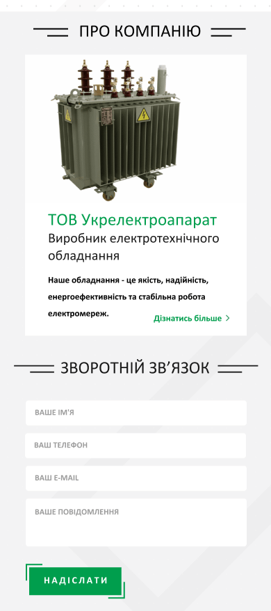
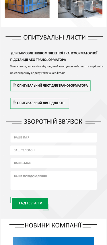
- “About the Company” Block: This block was redesigned to be more compact. We placed it in a convenient location on the main page and, crucially, integrated a contact form. This allowed clients who had reviewed the company information and felt trust to immediately proceed to communication without wasting time searching for contact details. This solution significantly reduced the “friction” on the path to conversion.
Before
After
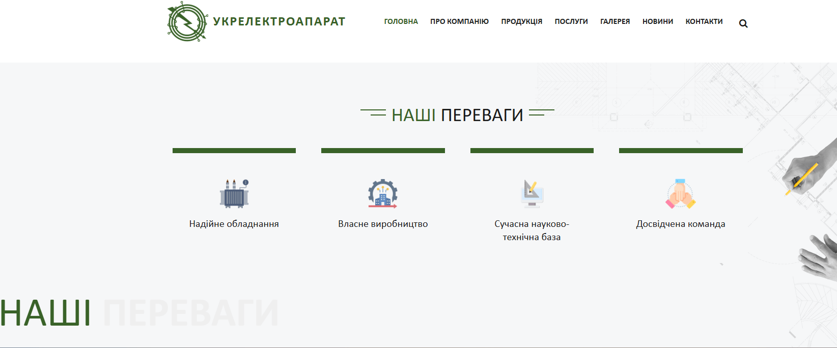
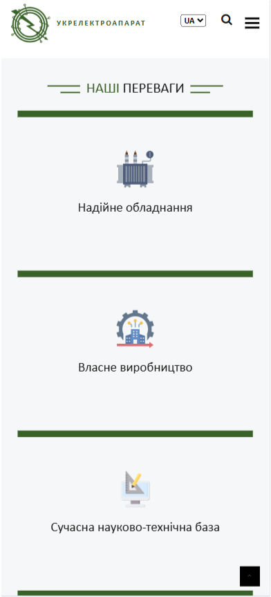
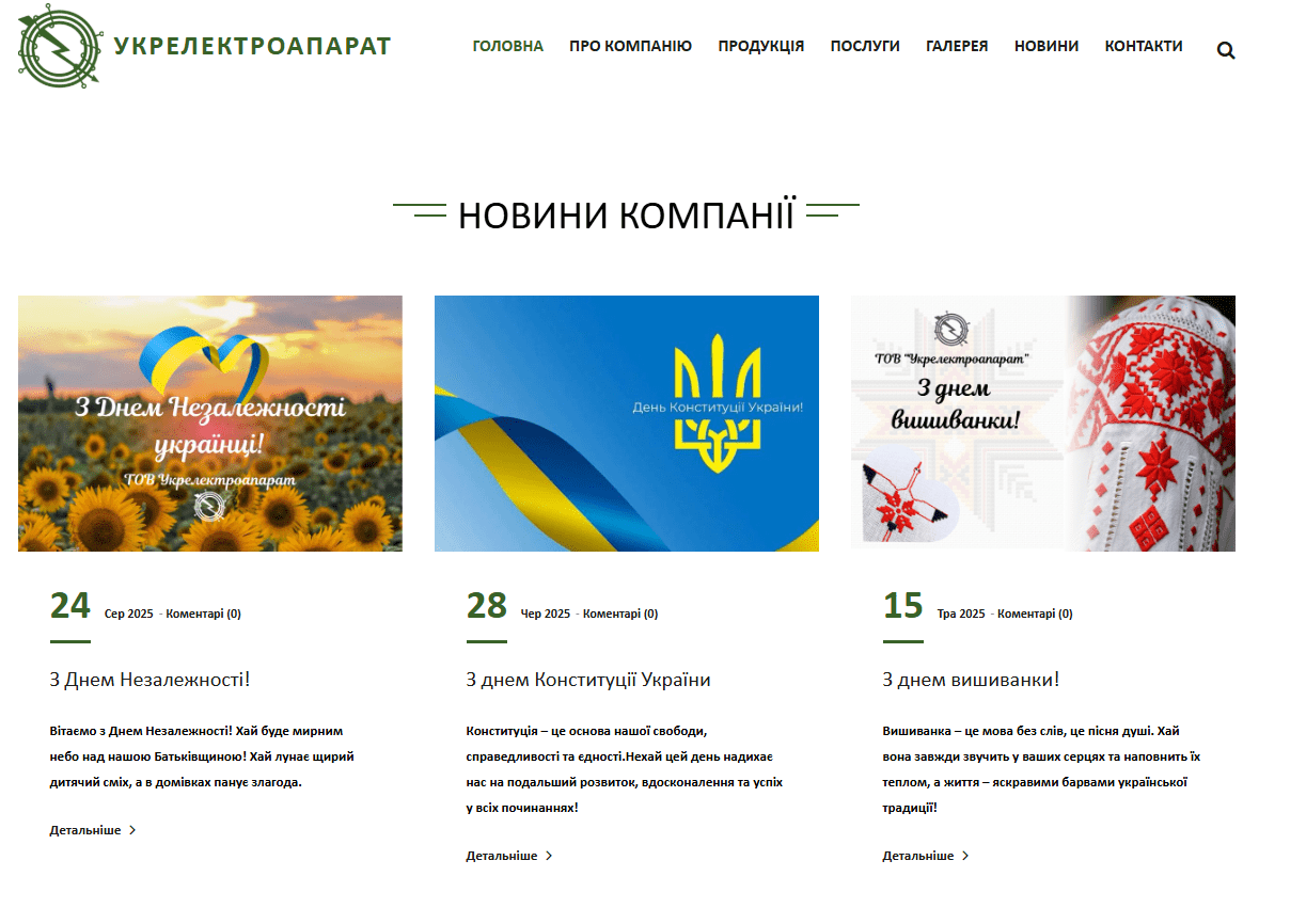
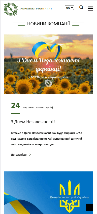
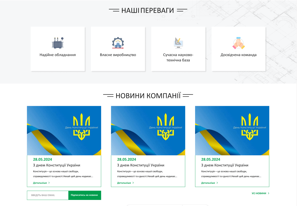
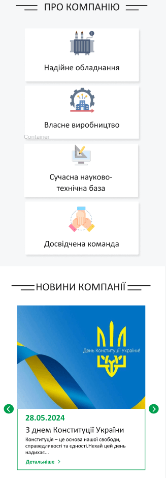
- Advantages and News Blocks: The blocks featuring our advantages and news also underwent design changes. We made them more visually appealing and easier to read. This increased user engagement and allowed for a more effective communication of the company’s values.
Before
After
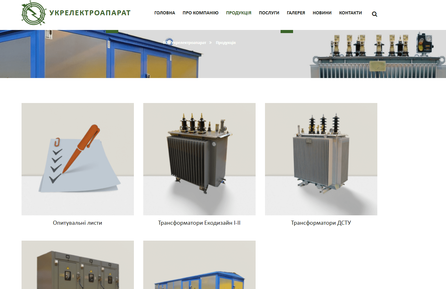
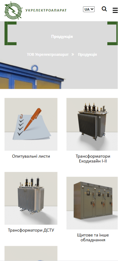
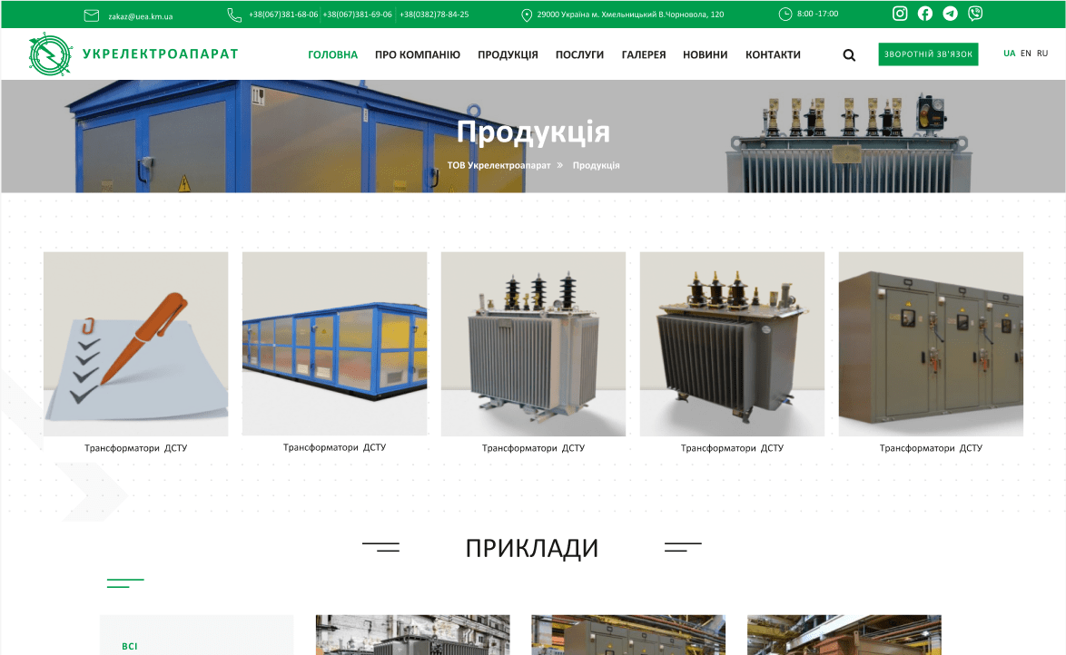
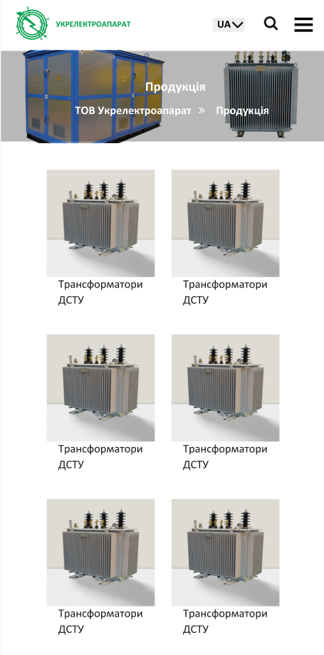
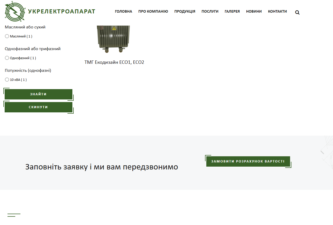
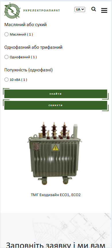
3. Changes to the Product Page
The product page is one of the most important on the website, as this is where the client searches for the item they need.
- New Block Structure: We completely changed the arrangement of blocks on the page. The most crucial information was moved to the top so that it immediately catches the user’s eye. This significantly sped up the search for necessary information.
- Category Tile Design: The size of the category tiles was reduced. They are now conveniently arranged in a single row, making navigation through categories intuitive and easy, especially on high-resolution screens. This allows the user to easily scan all available categories without excessive scrolling.
Before
After
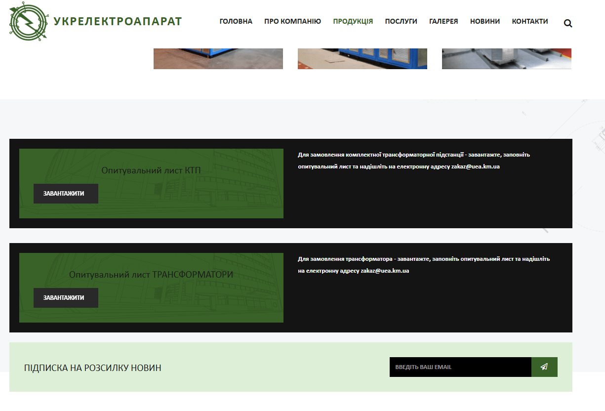
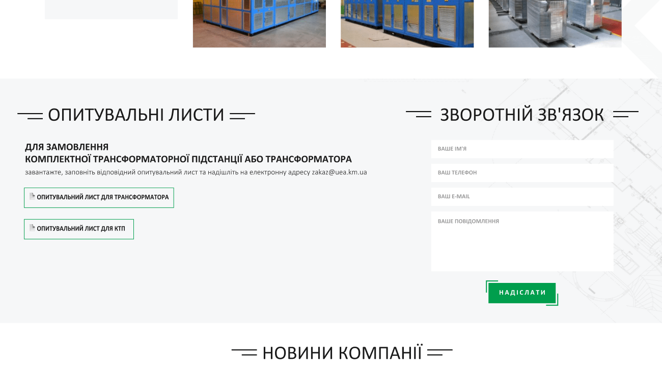
- Inquiry Form and Contact Form: The block with the inquiry form was completely redesigned. We combined it with the contact form, placing it in a convenient location on the product page. This solution simplified the process for clients wishing to receive a consultation or place a custom order.
Before
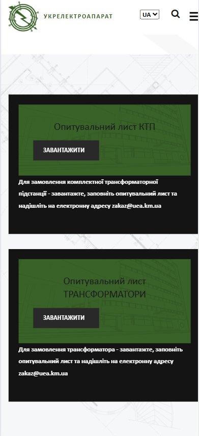
After
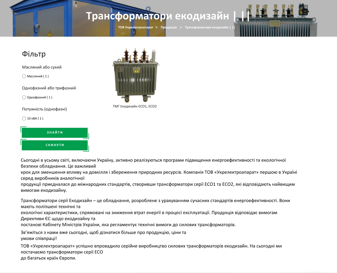
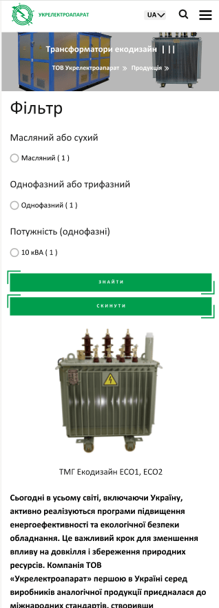
4. Changes to the Product Category Pages
Product category pages are a key element in the sales funnel. The main and perhaps most significant change was that the block with the category description, which was previously located at the bottom of the page, was moved up, right after the product tiles. This allowed the user to immediately see information about the category, which improved navigation convenience. This also has a significant positive impact on SEO optimization, as search engines now index the main text faster.
Before
After
 The result obtained


