
 Input data
 Progress of work
First, let’s understand why a user-friendly shopping cart is so important and how it increases your sales.
The shopping cart is one of the most crucial elements of any online store. It’s the final stage of the sales funnel, the place where a user makes the final decision to purchase. An inconvenient, cluttered, or non-intuitive cart can negate all the efforts spent on attracting a customer, showcasing a product, and stimulating interest. According to statistics, over 60% of potential purchases are left unfinished precisely because of problems with the cart or checkout process. This phenomenon is known as “cart abandonment.”
A well-designed cart directly impacts conversion and revenue. The simpler and clearer the path from adding an item to paying for it, the higher the likelihood that the customer will complete the purchase. Additionally, a convenient cart increases customer loyalty and satisfaction, encouraging them to return for repeat purchases.
What an Optimized Cart Affects:
- Increased Conversion Rate: A reduction in the number of “abandoned carts” directly leads to an increase in sales.
- Higher Average Order Value: Thanks to visually appealing related products, banners with promotions, or “buy more, save more” offers.
- Improved User Experience (UX): Customers feel comfortable and confident when the purchasing process is transparent and logical.
- Reduced Customer Support Load: Users are less likely to contact support with questions about placing an order.
- Positive Brand Image: An online store that cares about its customers is perceived as reliable and professional.
The Problem on the “Rushnychok” Website: Inconvenient Product Display
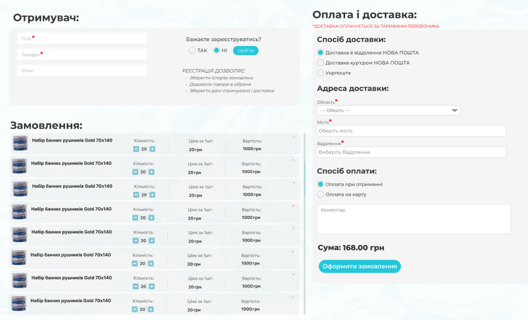
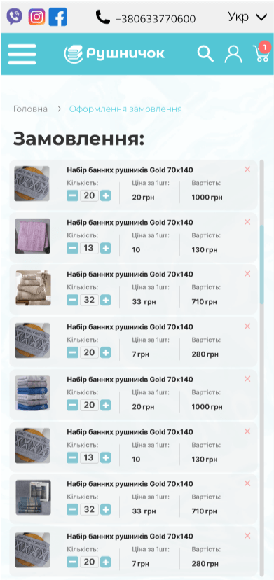
The “Rushnychok” online store, which specializes in selling textiles and towels, faced a serious problem. When a customer added more than 3 items to the cart, the interface became difficult to view.
Details of the Problem:
- Desktop Computers: Each product took up a large portion of the screen. With a high number of items, customers had to scroll for a long time to see all the products in their cart. This created a feeling of being overwhelmed and confused.
- Mobile Devices: The situation was similar. Due to the limited screen space and the large tile display of products, scrolling became endless, which often frustrated customers.
These flaws led to an increase in the cart abandonment rate. Customers simply grew tired of the inconvenient interface and left the site without completing their purchase. Analysis of user behavior confirmed that the peak of abandonment occurred precisely at the cart interaction stage, especially when placing large orders.
The cart was not fulfilling its main function—to be a convenient and transparent tool for finalizing and reviewing an order. Instead, it turned into a chaotic list where it was difficult to find a specific item, change its quantity, or check the total cost.
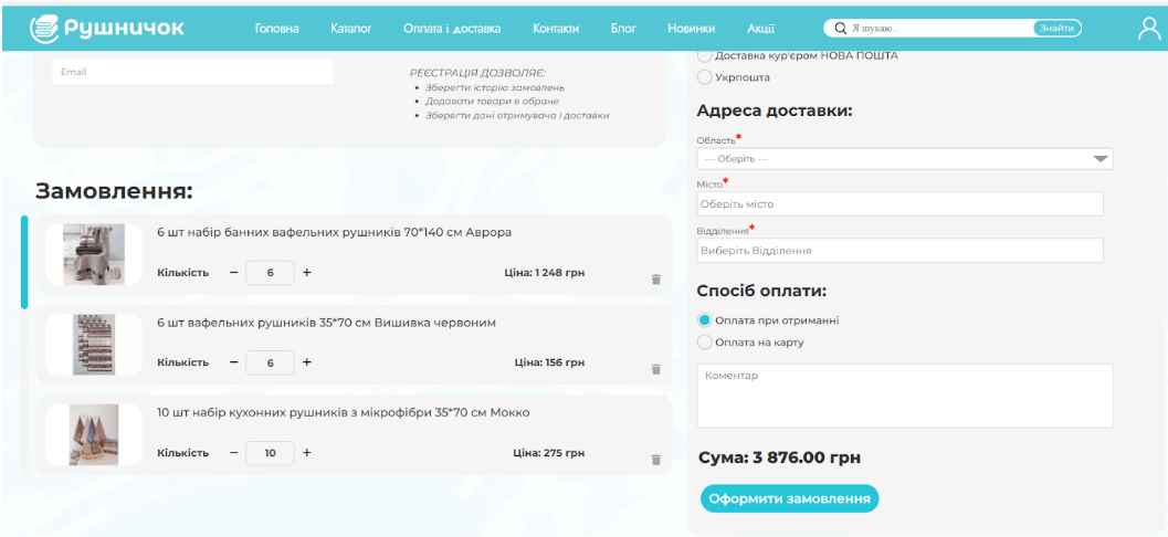
The Solution: Optimizing the Cart Interface
1. Creating a Compact and Informative Design
Our team of developers and UX/UI designers decided to redesign the cart, focusing on two key principles: compactness and transparency.
- Compact Display: Instead of large blocks, products began to be displayed in neat, horizontal rows. Each row contained all the necessary information:
- Miniature Product Image: Allows for quick product identification.
- Name: To avoid confusion between similar items.
- Quantity: With convenient “+” and “-” buttons for quick editing.
- Price per Unit: Provides an understanding of the cost of each item individually.
- Total Price per Item: Automatically updates when the quantity changes.
- “Remove” Button: In the form of an “X” icon, located in an easy-to-click spot.
This solution allowed users to see all added items and the total summary simultaneously, without the need for constant scrolling.
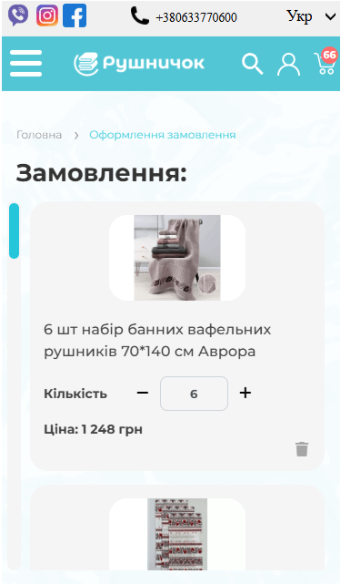
2. Adaptation for Mobile Devices
The mobile version received the same improvements as the desktop version. The compact horizontal product display format with essential product information was perfect for smaller screens. Additionally, the “+” and “-” buttons were enlarged for comfortable finger interaction, as was the “X” for removing an item.
 The result obtained


