 МИ ПРАЦЮЄМО ДЛЯ УКРАЇНИ
 Input data
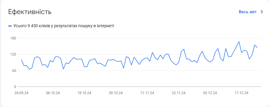
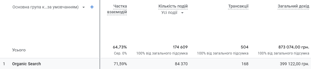
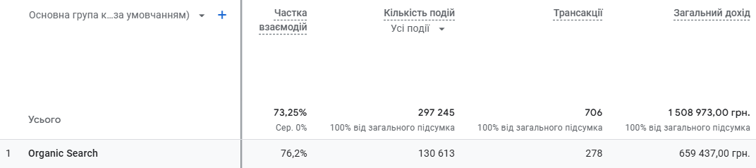
 Progress of work
During the website promotion process, we proposed improving the design of the home textile online store to make it more user-friendly and increase conversions. The main goal was to update key interface elements, including product tiles in categories, the website header, product filtering, and the creation of a convenient drop-down catalog menu. Additionally, all changes needed to be adapted for the mobile version.
We approached the task comprehensively, taking into account the individual needs of the client. A detailed analysis of the website, user behavior, and current design trends was conducted. Our specialists provided recommendations for improving the functionality and usability of the site. The developed layout was discussed and approved by the client, after which all updates were successfully implemented.
1. Website Header
The website header was completely redesigned, with new elements added, such as links to social networks. The search field was moved to a more visible location and now works faster thanks to the autocomplete function. Icons for authorization and the cart were combined into a compact block, making it easier to find the necessary items.
Header before:

Header after:

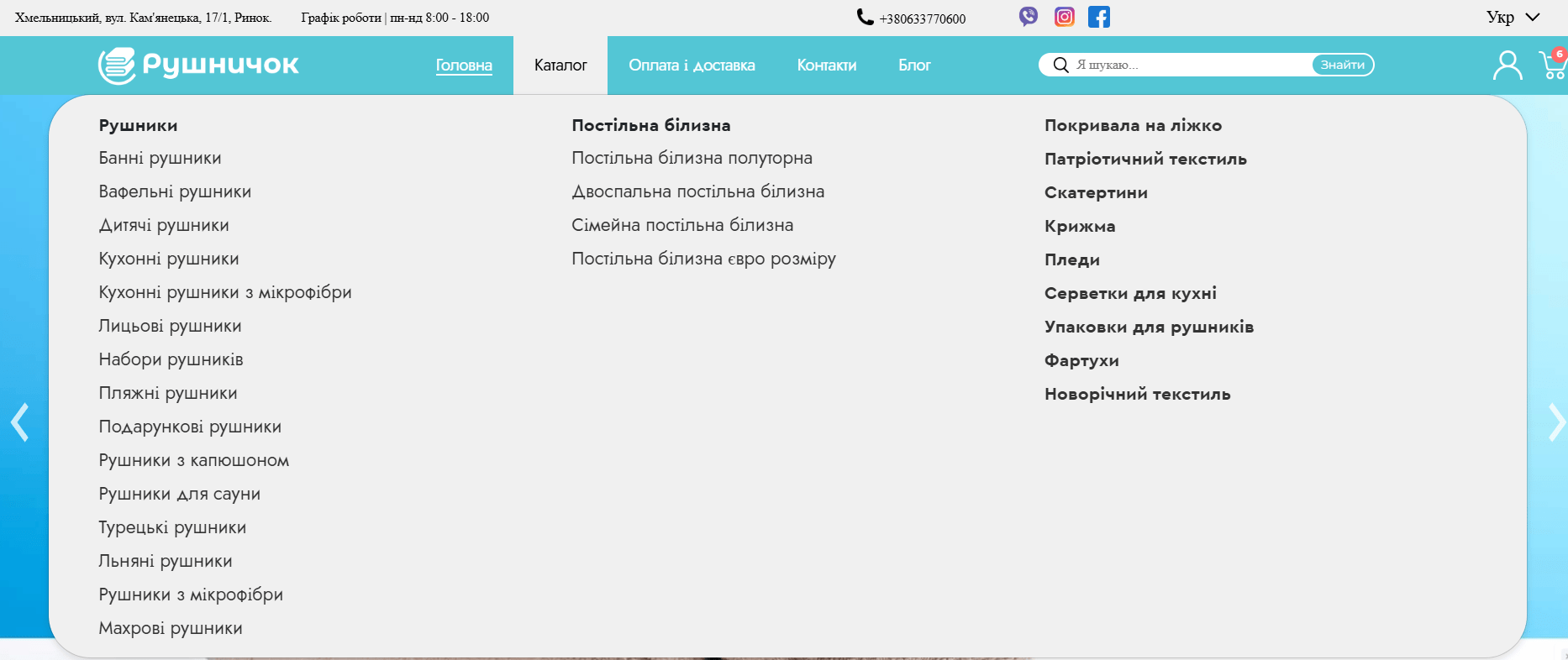
2. Catalog
One of the key updates was the introduction of a drop-down catalog menu, which was not present before. This menu automatically displays subcategories when hovered over, simplifying access to products.
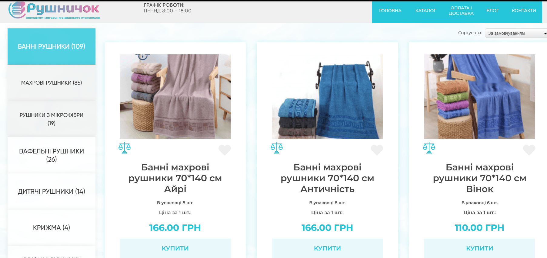
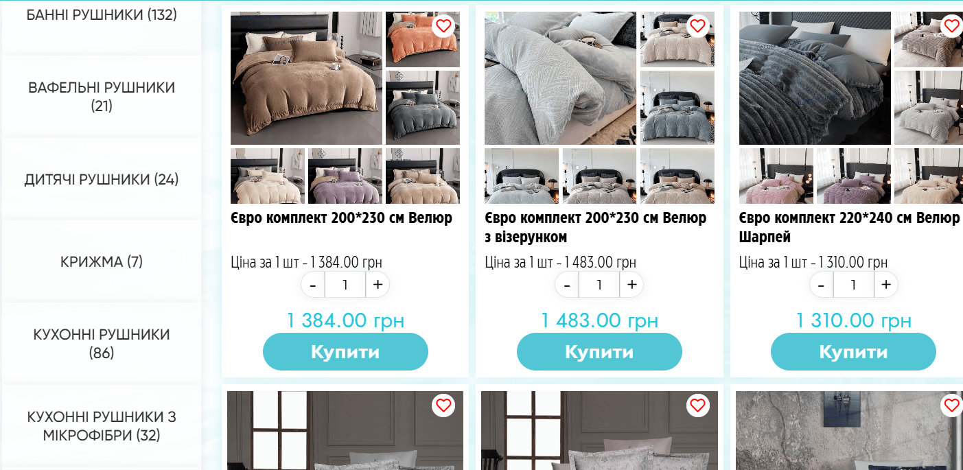
3. Product Layout on Pages
An important task was updating the product tiles. The old version was not very attractive, and the product cards appeared too large, resulting in fewer elements being displayed on the screen.
Product tiles before:
Product tiles after:

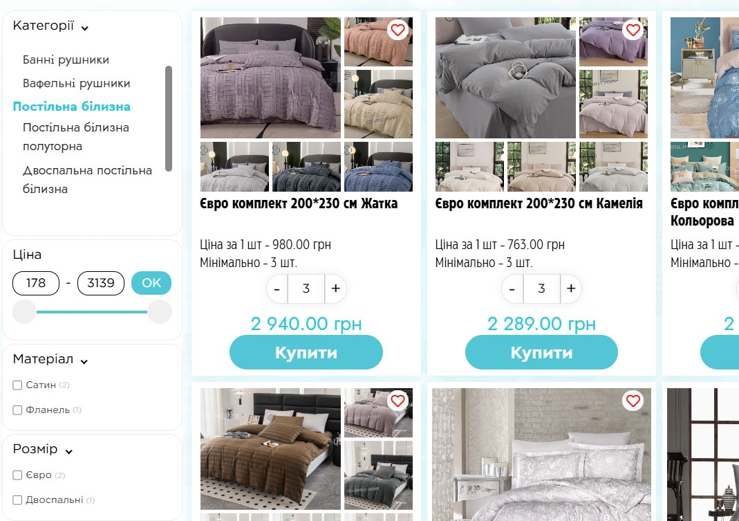
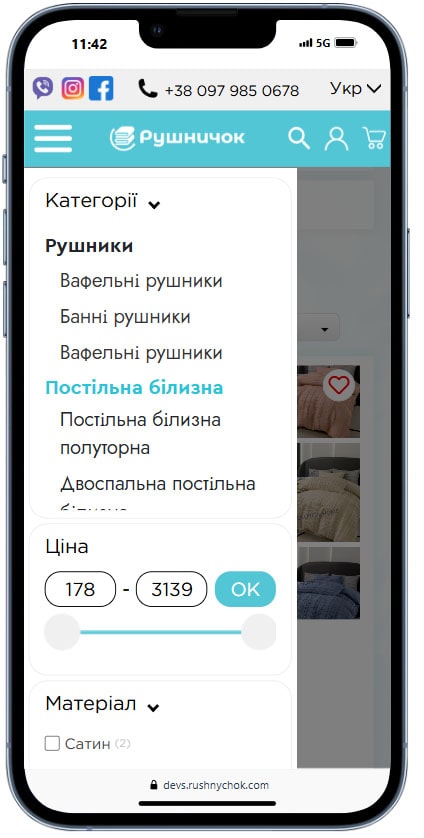
4. Product Filtering on the Page
Effective product filtering is one of the key elements of a convenient user experience for online stores. It helps quickly find the necessary products, reduces search time, and contributes to increased conversions. We focused on creating a functional and intuitive filtering system that meets the needs of users and the specifics of the assortment.
Before:
After:
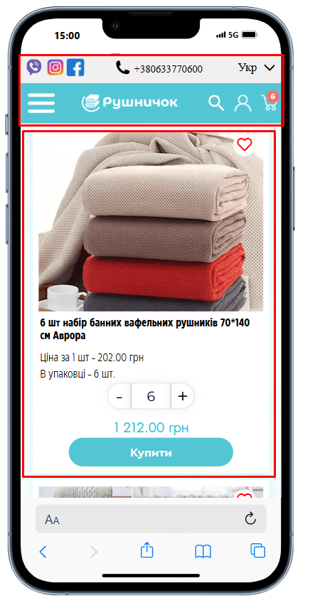
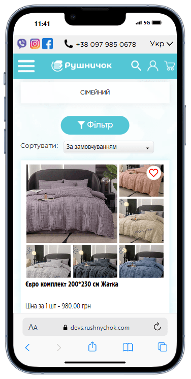
5. Mobile Adaptation
The mobile version of the website was fully adapted to incorporate all the changes. The catalog became easier to navigate, and the product cards now fit on the screen. The website header now meets mobile interface requirements, including simplified access to key functions.
Header and products before:
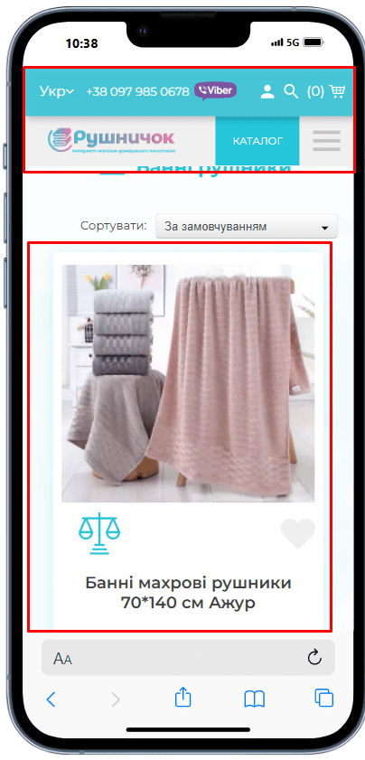
View after:
Burger menu before:
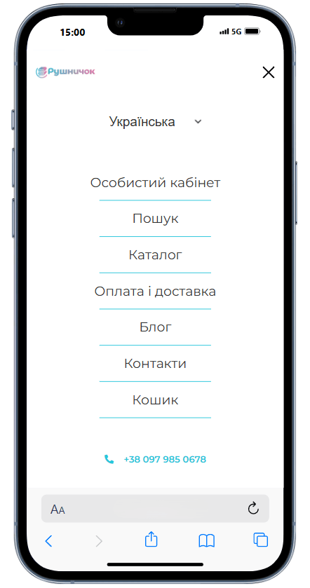
Burger menu after:


Filtering on mobile before:

Filtering on mobile after:
 The result obtained