РУССКИЙ ВОЕННЫЙ КОРАБЛЬ, ИДИ НА ХУЙМИ ПРАЦЮЄМО ДЛЯ УКРАЇНИ

Khmelnitsky, Zarichanska Street, 3/1,
floor 2, office 207

Ui/UX improvements for Molniya zipper maker

Ui/UX improvements for Molniya zipper maker

Information about the client

The company Molniya carries out a full cycle of production of plastic fasteners of various types, execution options and levels of complexity. It specializes in the production of woven zippers using German technology, using modern equipment from leading European and Asian manufacturers. This allows for high speed and flexibility in the execution of both serial and non-standard orders.

CLIENT REQUEST

During the long-term work on SEO, an analysis of user behavior on the site was carried out. Based on the received data, a problem with navigation was identified and recommendations for their elimination were offered. We always adhere to an integrated approach: quality SEO promotion is not only about improving positions in search engines, but also about optimizing all aspects of the site, aimed at improving the user experience and increasing conversions.

Вводные данные Input data

Market:

Ukraine

Niche:

Production and wholesale of zippers

Какие проводились работы Work progress

The main and primary task was to improve navigation between product pages. First, a detailed site audit was conducted to identify the main issues complicating the product search for users. Based on analytics data, surveys, and feedback, it became clear which aspects required improvement. Subsequently, a new, logically structured navigation was developed, ensuring convenient and quick access to the required products.

Several key areas of work were identified to implement improved navigation. Initially, a schematic prototype of the new menu was created, considering product categories, user requests, and their journey on the site. The main emphasis was placed on the intuitive placement of sections.

Next, the prototype was tested with real users to ensure the new structure was understandable and convenient. Based on the collected feedback, adjustments were made.

The next stage was the visualization of navigation. Designers developed a clear and aesthetic interface that harmoniously matched the overall style of the site.

How the navigation looked before:

Figure 1 — Old navigation

How the navigation looks after:

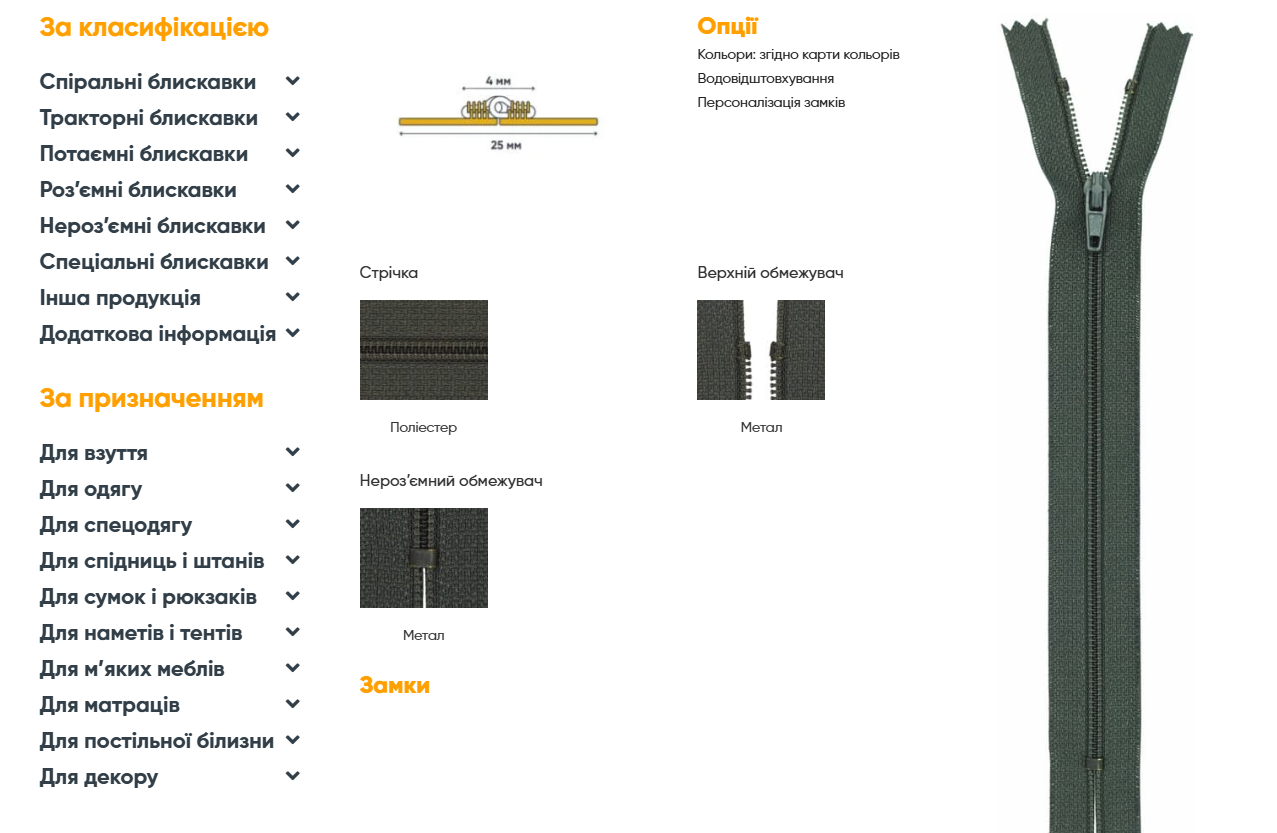
Figure 2 — New navigation

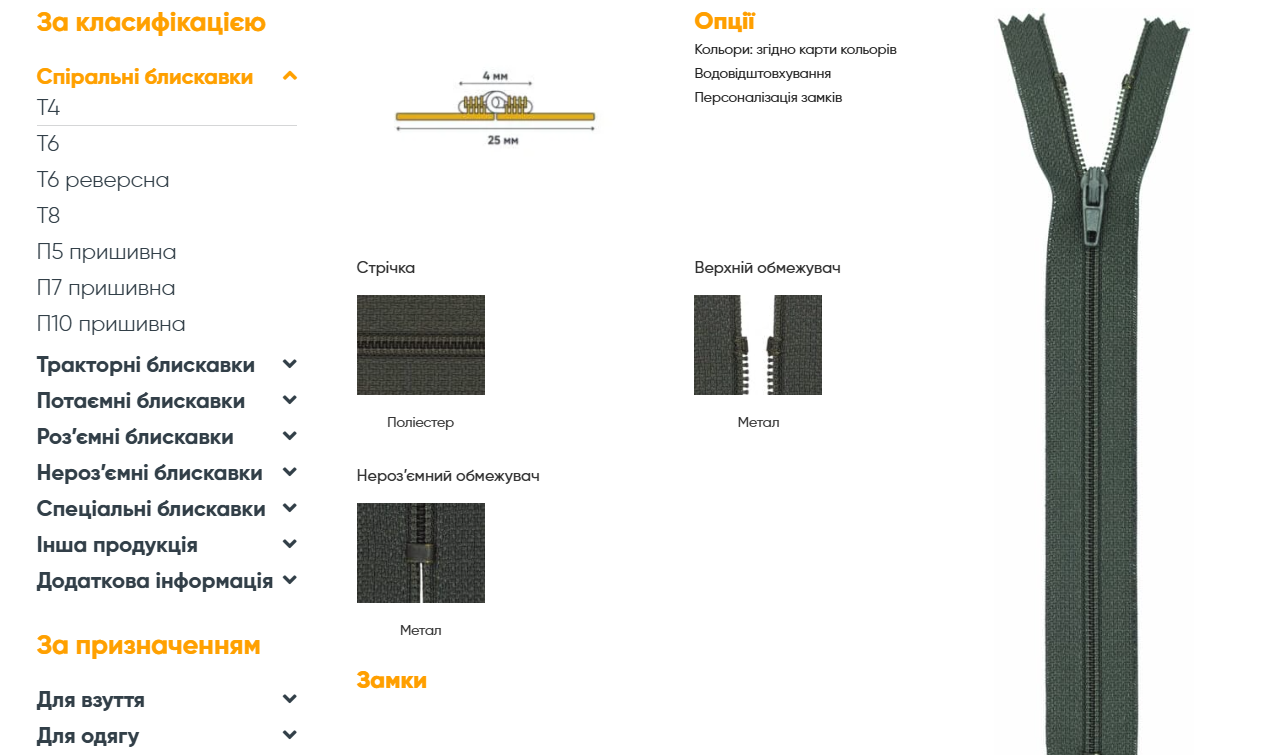
Figure 3 — New navigation

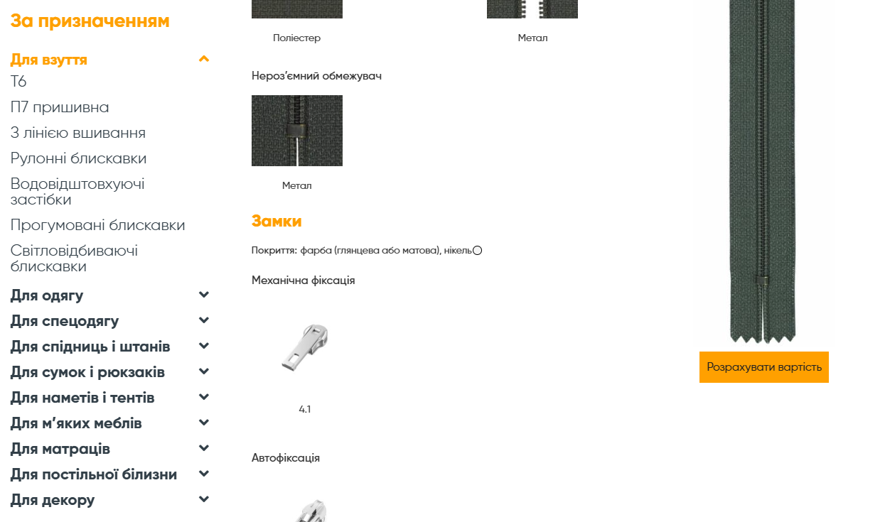
Figure 4 — New navigation

Полученный результат The result obtained

The final stage was the integration of the new navigation system on all language versions of the site and testing its operation in real conditions. After the launch, an analysis of metrics such as average time spent on the site, number of transitions between pages and conversion rate was carried out. The indicators improved significantly, which confirmed the effectiveness of the implemented changes.

Do you want your website to become convenient, stylish and effective?

We will create a modern design, optimize functionality and make your resource as productive as possible to achieve your business goals!

Do you need a modern website? We know what to do, leave a request below!