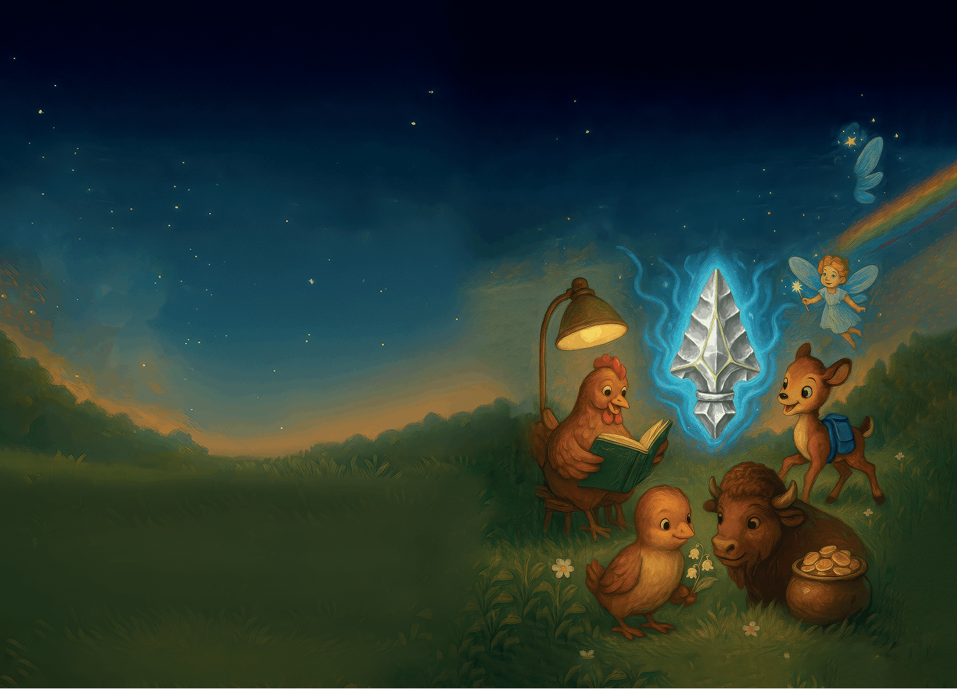
 Input data
 Progress of work
The development process began with a deep dive into the context. We understood that the book was written by the author during rehabilitation, a time when his “soul began to wander through fairy-tale worlds.” This became the foundation for the website’s visual language.
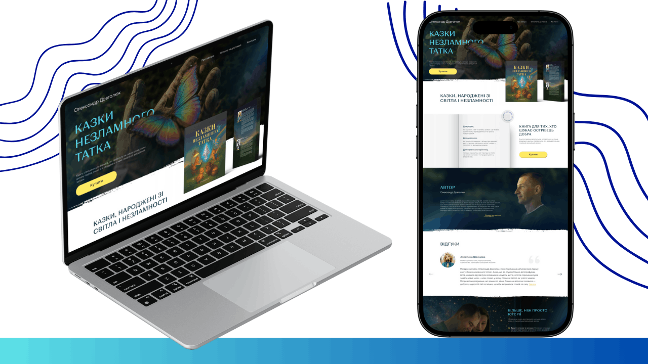
1. Visual Concept and Atmosphere Development
The first stage involved defining the color palette and style. We moved away from the standard bright colors typical of children’s stores in favor of deep, “evening” tones.
- Color Scheme: Deep dark blue and dark green became the primary colors, associated with evening reading before bed. Warm sunny yellow was used for contrast and to highlight key elements (the “Buy” button, accents on important thoughts).
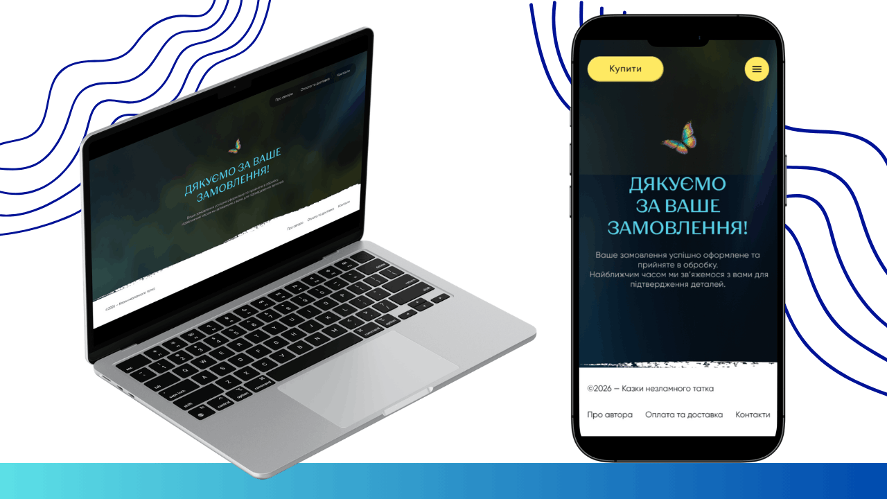
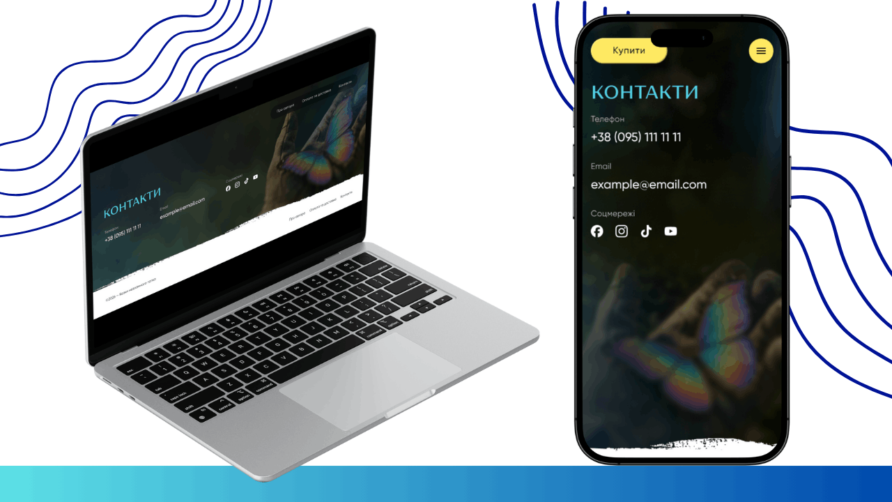
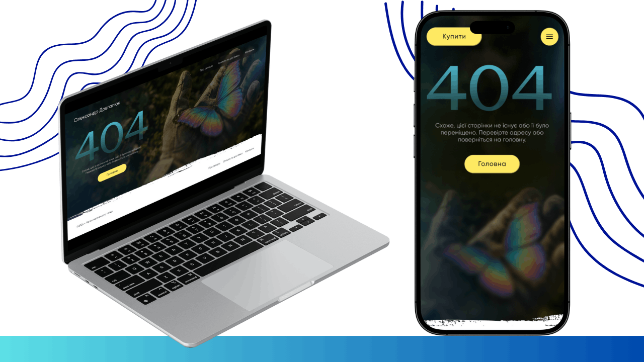
- Symbolism: The key visual image became a butterfly sitting on a hand in a military glove. This is a direct metaphor for the fragility of life and the strength of spirit that protects this fragility. This image runs like a thread through all pages, including the 404 page and the contact section.
- Textures: To separate blocks, we used a “torn paper” effect or paint strokes, adding tactility and the feel of a real paper book to the site.
2. Content and Page Structuring
The next step was designing the User Flow. The site had to be as simple as possible so that parents could quickly place an order without being distracted from the main thing—the content of the book.
- Home Page: Designed as a long read that gradually introduces the project’s mission. From the first screen with the offer to the “More Than Just Stories” section, which explains the therapeutic effect of the book.
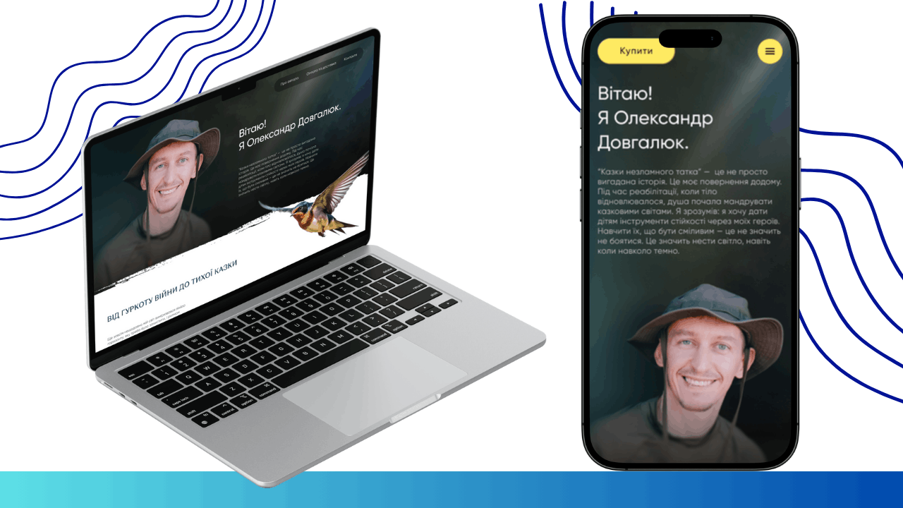
- Author Page: Here, we emphasized Oleksandr’s personality. We used a large portrait of the author and sincere text about the transition “from the rumble of war to a quiet fairy tale.” It was important to show that the author is a real person with their own experience of resilience.
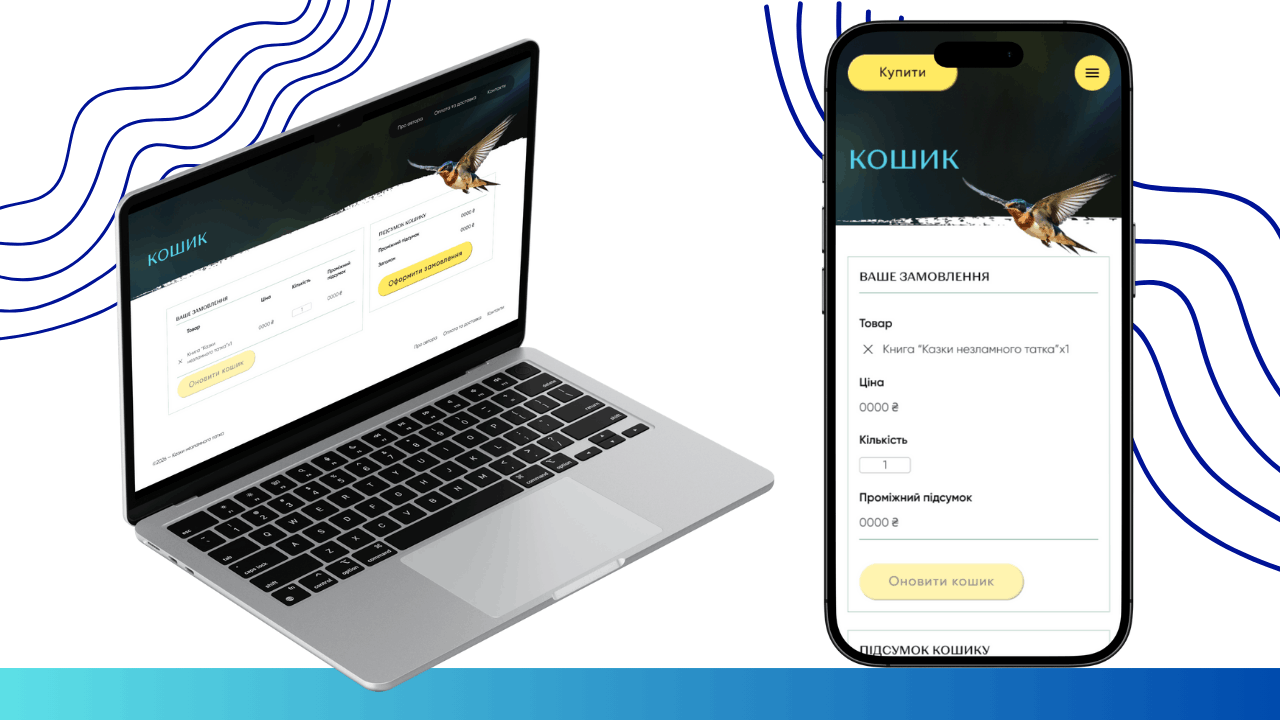
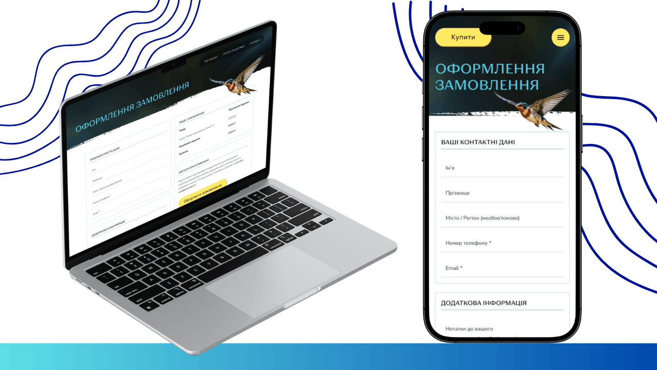
- Functional Pages: The cart and checkout page are designed in light tones on a white background, ensuring maximum readability and convenience for filling in data.
- Contacts: A concise page with all necessary communication channels (phone, email, social networks), set against the signature image of the butterfly in a military glove.
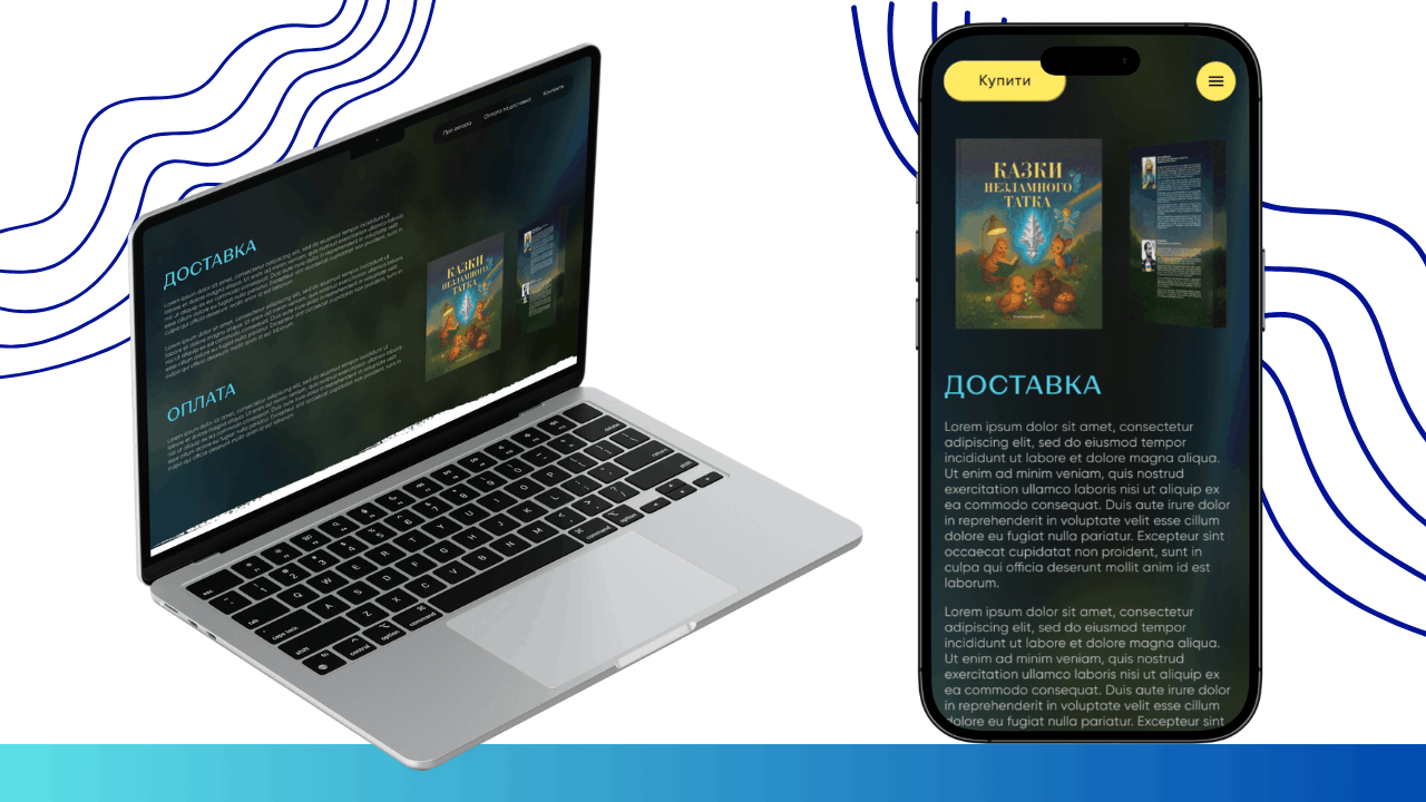
- Shipping and Payment: A separate page containing clear instructions and terms for receiving the book, helping to resolve all user questions before purchase.
- 404 Page: Even a technical error was styled to fit the overall concept—featuring the branded butterfly and a button to return to the home page to maintain the connection with the user.
3. Work on UX/UI Elements
We focused on small details that shape the overall impression:
- Typography: Modern sans-serif fonts were used, which read well in both large blue headings and main body text.
- Interactive Elements: Buttons have rounded corners, visually making the interface “softer” and safer.
- Animation Accents: Using flying butterflies and birds (swallows) adds dynamics and lightness to the pages.
4. Mobile Adaptation
Since over 80% of traffic for such projects comes from social networks via smartphones, the mobile version was a priority.
- Block Adaptability: All complex compositions (e.g., a book next to text) rearrange into a vertical stack.
- Thumb-Friendly Design: Order buttons and navigation menus are adapted for comfortable one-handed use.
- Loading Speed: Heavy graphic elements like the butterflies were optimized so the site opens instantly even with weak mobile internet.
- Order Forms: Input fields in the cart and during checkout have been enlarged for easy text entry on touch screens.
 The result obtained


