
 Input data
 Progress of work
First, let’s learn what a SEO audit is and why you need it.
SEO audit — is a comprehensive check of your website aimed at identifying all factors that influence its visibility in search engines. Simply put, it’s a “medical examination” of your website that helps you understand why it holds certain positions in Google or other search engines.
Why do you need it? Without a SEO audit, you’re acting blindly. It allows you to:
- Identify weaknesses: find errors that prevent search bots from correctly indexing your site.
- Optimize performance: improve loading speed, mobile adaptation, and other technical aspects.
- Enhance user experience (UX): make the site more convenient and understandable for visitors.
- Increase traffic and conversions: ultimately, bring more potential clients and boost sales.
Website Technical Audit
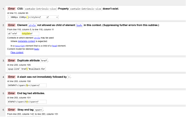
A thorough *technical audit of the website was conducted, which revealed a number of critical issues negatively impacting its search engine optimization and indexing:
- Code validity errors: We noticed “rough edges” in the website’s program code. This is like grammatical errors in text – search bots can misinterpret them, complicating indexing and ranking.
- Many 301 redirects: It turned out that the site has too many redirects. This not only slows down page loading speed, annoying users, but can also “dilute” link equity, reducing the effectiveness of your link building.
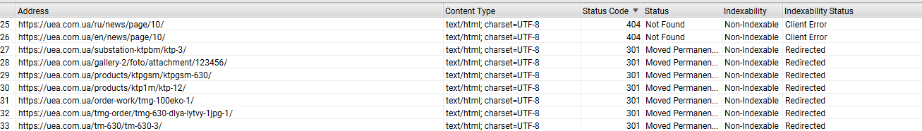
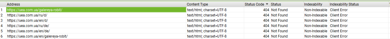
- 404 pages present: We found “broken” links and pages that simply don’t exist. These are essentially “dead ends” for users and search bots, negatively impacting the website’s user experience and reputation.
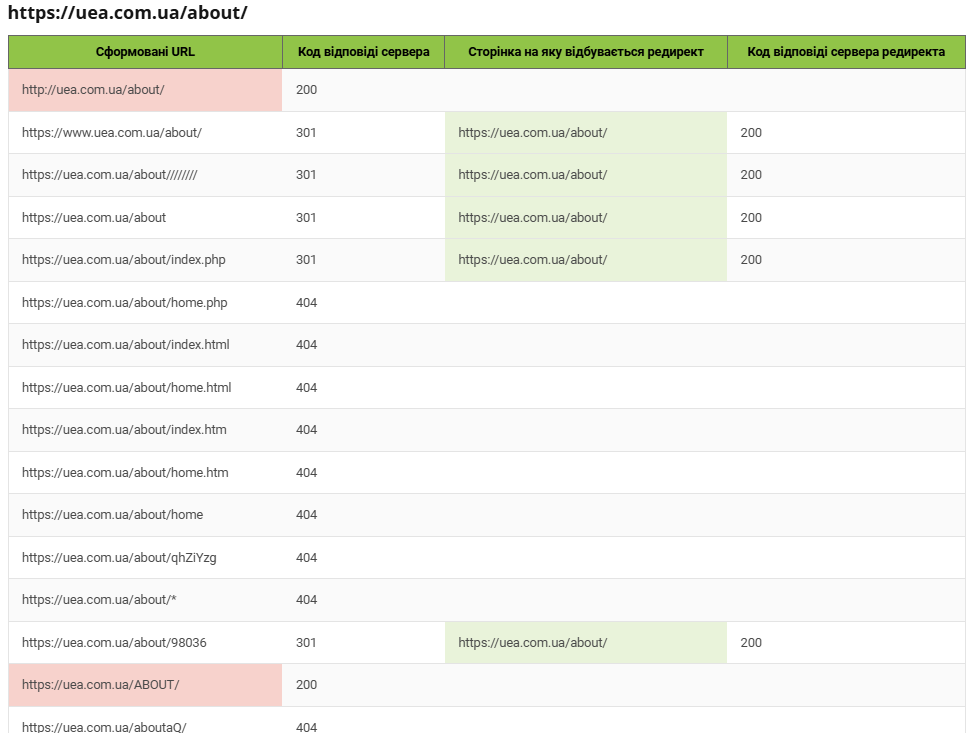
- Cyclical links: The site has links that lead to closed loops or constantly redirect to already visited pages. This creates endless wandering for the user and prevents search bots from effectively crawling the resource.
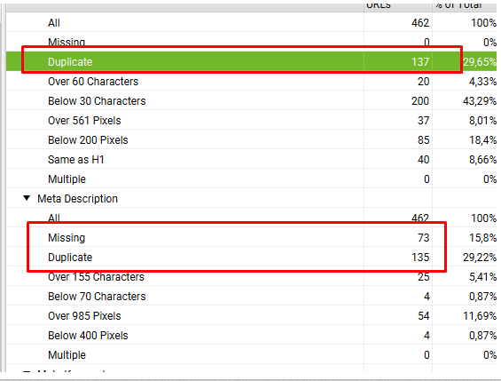
- Duplicate pages: A significant problem was the presence of identical content accessible via different URLs. This leads to “scattering” of search weight and confuses search engines, making it difficult to determine the “original.”
- Language versions: Although the site has three language versions, we noticed that not all content has been translated into the respective languages. This creates inconsistency and reduces the quality of interaction for foreign visitors, as they expect full adaptation.
- Duplicate H1 tags and metadata (Title and Description): This is one of the most critical issues. H1 headings and key metadata, such as Title and Description, were found to be duplicated. Moreover, metadata is only applied to one of the language versions, meaning the same set of metadata in one language is used for three different languages. This significantly complicates the site’s ranking for relevant queries in different language segments.
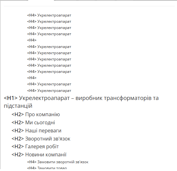
- Incorrect H heading sequence: The heading structure (H1, H2, H3, etc.) was often violated. This makes the text difficult to read and understand, both for humans and for search bots, which use headings to determine content hierarchy.
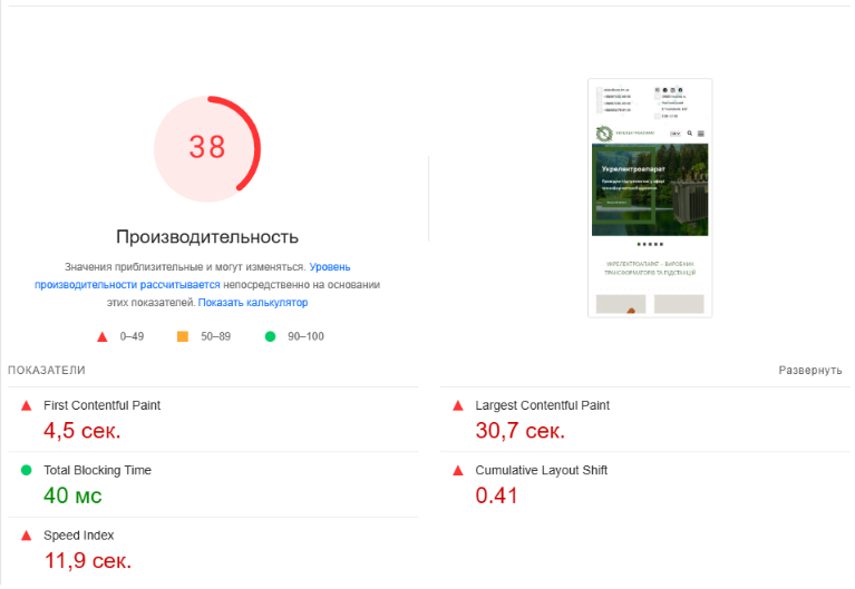
- Poor website loading speed: Unfortunately, the site loaded too slowly. This is not only a key ranking factor for Google but also a serious source of frustration for users who aren’t willing to wait and will simply close the page.
Usability Audit: A User’s Perspective
In parallel with the technical deep dive, we conducted a usability audit, putting ourselves in the shoes of a regular visitor. And here, many “pain points” were revealed that deter potential customers and disrupt their interaction experience:
- Empty pages present: We found pages without proper content or with a minimal amount of it. This creates an impression of incompleteness, as if the site is still under development, and can undermine visitor trust.
- Low-quality images: Many images were blurry, low-quality, or simply not optimized for the web. This not only spoils the visual impression of the site but also slows down its loading.
- Lack of delivery and return information: For a commercial website, this is a critical gap. Potential buyers don’t see clear conditions, which raises doubts and is a serious obstacle to completing a purchase.
- Missing prices: We noticed that many products simply didn’t have a price indicated. This is like going to a store where goods are displayed but without price tags – it’s impossible to make a purchasing decision.
- Lack of proper product descriptions: Some products had very sparse or no descriptions at all. Users don’t get a full understanding of the product, which reduces their interest and desire to buy.

- Limited product purchase options: The ability to purchase a product was extremely limited – only via email or feedback form. In today’s world, where everyone is accustomed to quick online purchases using convenient lead forms or a shopping cart, this is a huge barrier. It forces the customer to take unnecessary, cumbersome steps, which sharply reduces the likelihood of conversion.
 Полученный результат


