
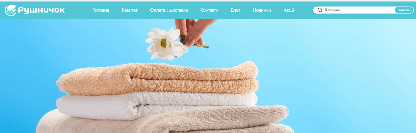
 Input data
 Work progress
First, let’s understand what a usability audit is and why you need one.
Usability audit – is a comprehensive analysis of a website or application aimed at identifying problems that complicate user interaction with the resource. Simply put, it’s a check of how convenient and understandable it is for visitors to use your website.
Why is it needed? The main goal of an audit is to improve the User Experience (UX). When a website is intuitive, easy to navigate, and effectively meets user needs, it leads to a significant increase in key metrics:
- Increased conversion: The ease of finding products and placing orders directly affects the number of successful purchases.
- Growth in average check: A convenient catalog and clear filters encourage users to explore a wider range.
- Increased customer loyalty: A positive experience interacting with the site encourages repeat visits.
- Reduced bounce rate: Users stay on the site longer if it meets their expectations.
- Improved SEO positions: Search engines consider behavioral factors, and good UX positively affects the site’s ranking.
During the audit of the “Rushnychok” online store, a number of problems were identified that negatively affect the usability of the site and can lead to the loss of potential customers. These problems were classified into different categories to provide a holistic view of potential areas for improvement.
Identified Problems
Trust and Branding Issues
- Lack of slogan near the logo: A logo without an accompanying slogan loses some of its potential. A slogan could immediately convey the main mission, unique selling proposition, or key advantages of the store to the visitor.
- No quality marks or certificates: For a store selling textile products, visual confirmations of quality, such as conformity certificates, environmental safety marks, or partnerships, are critically important. Their absence reduces the trust of potential buyers who are concerned about the quality of materials and production.
- No information about the store or brand history: Modern users don’t just buy products; they want to know who is behind the brand, its values, creation story. A story about “Rushnychok”‘s mission, its founders, philosophy, or production features could create an emotional connection and increase loyalty.
Registration and Personal Account Issues
- No social media login: In a world where speed and convenience are key, the requirement to create a new account from scratch without the option of quick login via Google, Facebook, or other social networks can deter a significant portion of users.
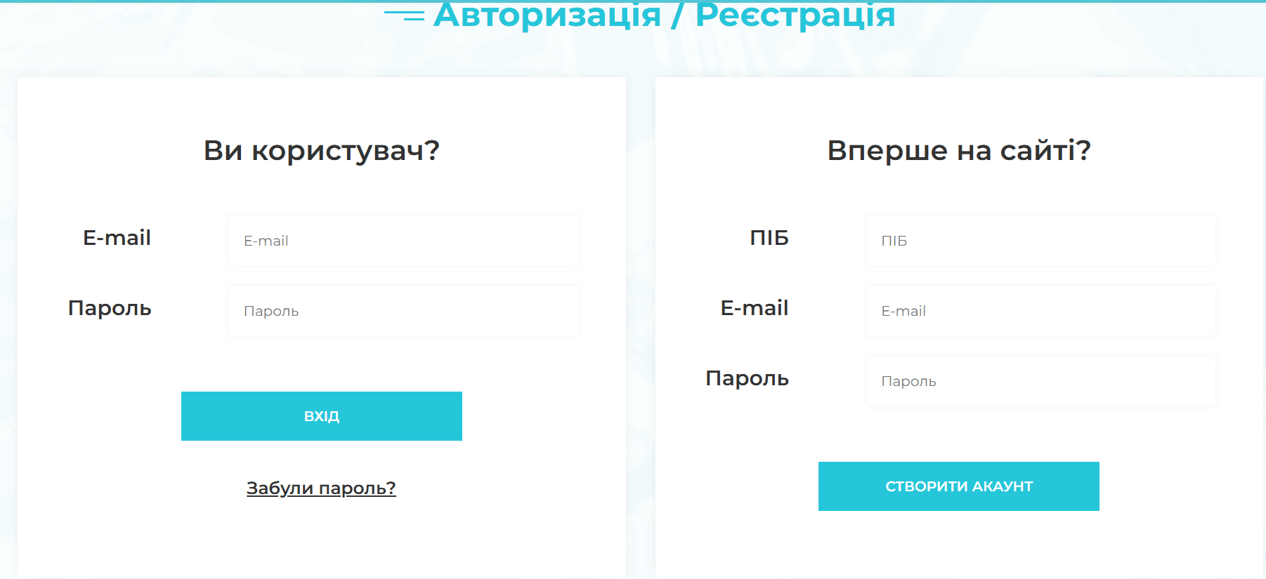
- No privacy policy information: This is a basic but critically important element of trust for any online service. The absence of a clearly formulated and accessible privacy policy raises concerns about the security of personal data, which can discourage registration or purchases.
Product Card and Information Presentation Issues
- No zoom on product photos: For an online store selling products where details, texture, and pattern are important (e.g., embroidered towels, fabrics), the lack of a zoom function on photos significantly impairs product perception. The user cannot assess quality and small elements.
- Incomplete product characteristics: Insufficient information about the product – dimensions, fabric composition, care recommendations, country of origin – forces the user to look for it on third-party resources, contact support, or even abandon the purchase due to the lack of a complete picture.
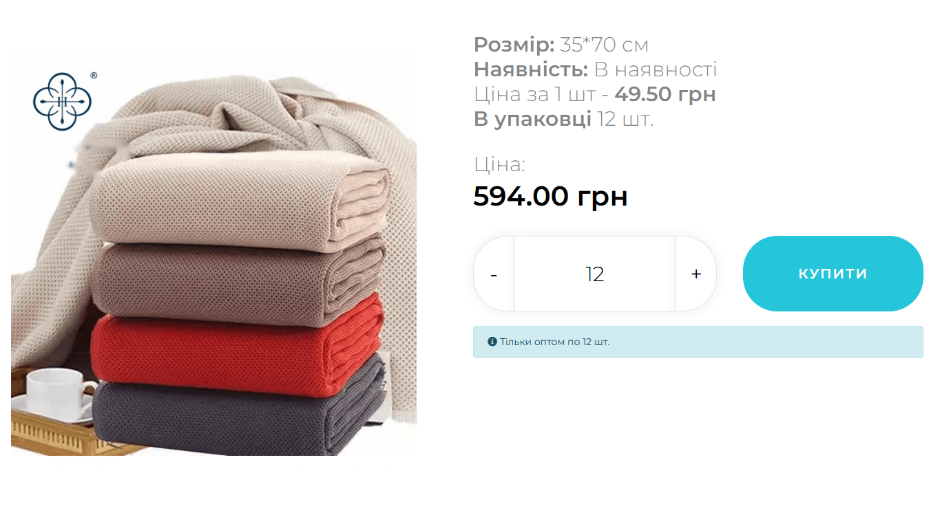
- Optional video with product in card: Video reviews significantly improve the understanding of a product, especially for textile products where tactile sensations, drape, and the real look of color and texture are important. A short video demonstrating a towel in action or its details can be a powerful tool for making a purchase decision.
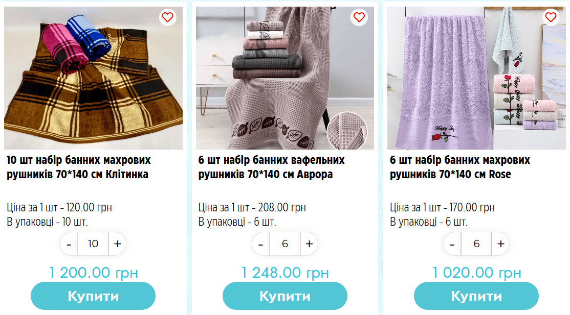
Catalog and Filtering Issues
- Errors when resetting product filters: Incorrect filter operation – when the full assortment is not returned after resetting filters, or when filters work with errors – creates inconvenience and annoys users trying to find the right product. This leads to premature site abandonment.
- Unpopular products shown first: Default sorting of products in the catalog by unpopular items, by novelty, or alphabetically (if not otherwise specified) can deter visitors, as they don’t immediately see the best, most popular, or most relevant offers. It would be optimal to set sorting by popularity, recommendations, or allow user selection.
Feedback and Support Issues
- No incentive to leave reviews: Reviews are powerful social proof and one of the main factors influencing purchasing decisions. The lack of mechanisms for collecting them (e.g., post-purchase reminders) and incentives (bonuses, discounts for reviews) reduces the level of trust in the products and the store as a whole.
- No quick one-click ordering: For those who know exactly what they want to buy, or for regular customers, the option of quick ordering significantly saves time and simplifies the purchase process, minimizing steps to complete a transaction.
- Missing FAQ page: Frequently asked questions and their answers help quickly resolve typical user problems (delivery, payment, returns, sizes), alleviating the support service’s workload and improving self-service.
- No feedback form: The absence of a simple and clear way to contact the store (other than phone or email) reduces the level of trust and leaves users without the ability to quickly get an answer to their question.
- No online consultant: Chat with a consultant is the fastest way to get answers to questions in real time. This is very important for quickly making a purchase decision, especially for those who have doubts or need additional information.
Design and Readability Issues
- No visual hierarchy of headings: Poor text structure and the absence of a clear heading hierarchy (H1, H2, H3) make the site difficult to perceive and navigate. It’s hard for users to scan the page and find the information they need.
- Text on the site is poorly readable: Low contrast between text color and background causes eye strain, especially during prolonged reading. This complicates information perception and forces users to quickly leave the site due to discomfort.
- No help functionality when search yields no results: When a user finds nothing (e.g., when searching for a non-existent query), an empty page causes frustration. Instead, alternatives should be offered: similar products, links to popular categories, recommendations, or a suggestion to change the query.
Common Mistakes Often Found in Online Stores
- Overloaded design: Too many elements, colors, and fonts can distract the user and complicate navigation, creating a sense of chaos.
- Lack of mobile adaptation: Most users access websites from smartphones. Non-adapted design that requires zooming and horizontal scrolling is a direct path to losing a significant portion of potential customers.
- Complex checkout process: Too many steps, mandatory fields that don’t make sense, or the requirement to register to make a purchase can cause abandonment at the final stage.
- Low-quality product photos: Low-resolution images, poor lighting, lack of photos from different angles, or “live” photos deter buyers who cannot fully assess the product.
- Lack of clear calls to action (CTAs): The user must clearly see what to do next. “Buy,” “Add to cart,” “Learn more” buttons should be noticeable and understandable.
- Outdated information: Outdated prices, out-of-stock items without appropriate notification, broken links – all this causes irritation and reduces trust in the store.
 The result obtained


