
 Input data
 Project plan
- Coordination of technical specifications
- Development and creation of individual design
- Layout of design layout
- Website creation
Progress of work
The development of any website begins with careful planning and defining the client’s needs. The first stage of our work was filling out a brief by the client, which allowed us to define all the key points of the future project. In this document, the client described in detail his wishes for the design, functionality, target audience and the main tasks that the site should perform. Thanks to this, we got a clear idea of the final result that we are trying to achieve.
Filling out the brief became the basis for creating a technical task, which took into account both the visual part of the site (design, color scheme, page structure) and the functional part (integration with CRM, adaptability for mobile devices, loading speed, etc.). This stage allowed us to align the client’s vision with our recommendations, ensuring effective communication and the right vector of work.
Having a clear technical task, we were able to plan the stages of development, determine the deadlines, and also make a list of the resources required to implement the project. This approach ensures that each stage of the work is performed efficiently and meets the client’s expectations.
After receiving a clear technical task, we began developing the site, where the following pages were created:
- Home page
- Blog/News
- Product catalog
- Product card
- Payment and delivery
- Contacts
- Reviews
- FAQ
- Cart
More about the developed pages
1. Home page
The home page is the face of any website and the first point of user interaction with the brand. This is where the first impression is formed, influencing the further interest of the visitor. When creating the home page, we focused on its intuitiveness, attractiveness and functionality. All key information was structured so that the user immediately received answers to their questions and could easily move on to other sections of the site.
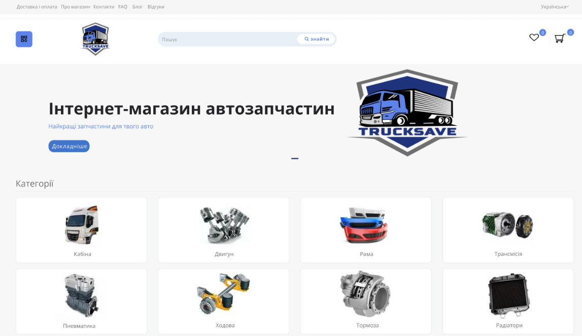
Figure 1 — Start of the main page
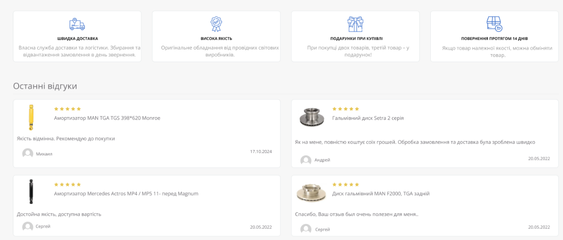
Figure 2 — “Benefits” and “Reviews” blocks on the main page
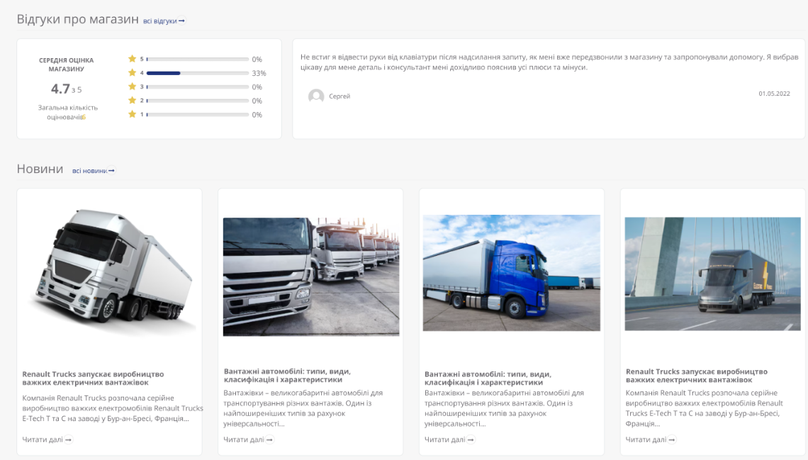
Figure 3 – Blocks with store rating and latest news
2. Blog/News
The “Blog/News” section was created as a tool for attracting an audience and increasing brand awareness. It performs several important functions: it informs visitors about the company’s latest news, shares useful tips and expert articles, and helps improve the site’s SEO optimization.
We took care of the convenient structure of the section, allowing users to easily find interesting content. The design is developed so that publications look attractive and are comfortable to read both on the desktop and on mobile devices. Thanks to this section, the site becomes not only a platform for sales, but also a source of useful information for customers.
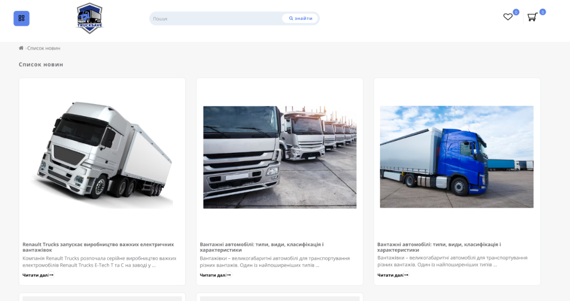
Figure 4 — Blog Page
3. Product catalog
The product catalog is a key section of the site that provides convenient access to the entire product range. During its creation, we focused on intuitive navigation, structure and attractive design so that users could quickly find the desired product.
Each category was carefully thought out, and product pages are equipped with filters, search and a convenient sorting system. This allows visitors to easily view the product range, get detailed information and make purchasing decisions. Our approach ensured effective user interaction with the catalog, contributing to sales growth and customer satisfaction.

Figure 5 — Product Catalog
4. Product cards
The product card is a key element of the site, where the user gets all the information they need to make a purchase decision. In this section, we focused on creating a convenient and informative design that allows you to quickly find answers to key questions: characteristics, price, availability, delivery and payment options.
The product card contains high-quality images, a detailed description, customer reviews and recommendations for related products. We also integrated a convenient button for adding to the cart, which ensures a simple and quick checkout process. All this makes interaction with the product card as comfortable as possible and helps increase conversion.
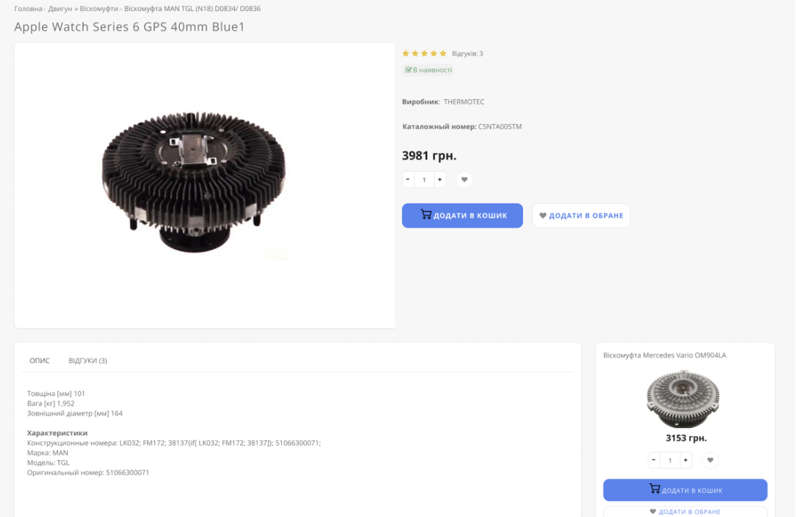
Figure 6 — Product map
5. Payment and delivery
The “Payment and Delivery” section was created to provide users with comprehensive information about payment methods and order delivery conditions. We focused on its structure and clarity to simplify the process of planning a purchase for customers.
This section describes the available payment methods, including bank cards, online services or cash, as well as delivery options – from courier service to pick-up. In addition, the order fulfillment times and delivery costs were indicated, which allows customers to clearly calculate their expenses. The intuitive design of this section provides users with comfort and trust in the brand.
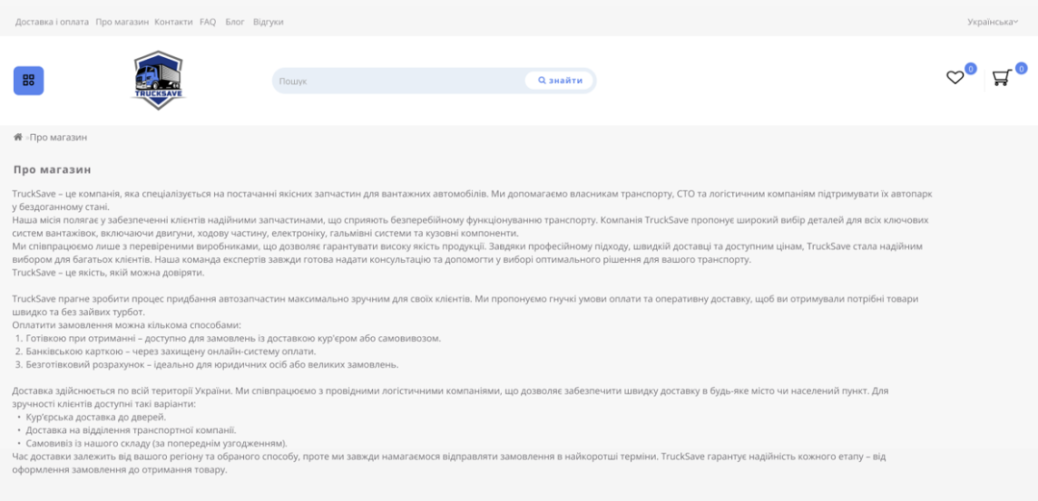
Figure 7 — “Deliveries and Payments” page
6. Contacts
The “Contacts” section is an important part of the site, as it provides users with convenient access to all the necessary data for contacting the company. It contains not only addresses and phone numbers, but also a feedback form that allows you to quickly send a request or get advice.
We made sure that this section was as clear and accessible as possible for every visitor to the site. The specified coordinates, work schedule and additional methods of communication allow customers to easily get answers to questions or clarify important information. The “Contacts” section helps to create a sense of reliability and openness of the brand to potential customers.
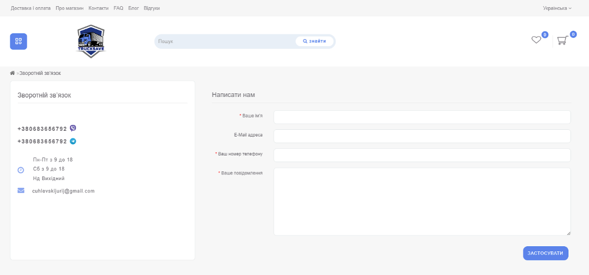
Figure 8 — “Contacts” page
7. Reviews
The Reviews section is designed to allow potential customers to read what other customers think about the company’s products or services. Reviews play an important role in building trust in a brand, as they provide real information about other people’s experiences and the quality of the products.
This section collects user comments and ratings, allowing you to get feedback on each product or service. This not only helps potential customers make informed decisions, but also allows the company to receive valuable feedback for further improvement of the product range and service. The review system also provides an opportunity to interact with customers, which helps to create strong and long-term relationships.

Figure 9 — “Reviews” page
8. FAQ
The “FAQ” section (Frequently Asked Questions) is designed to help users quickly find answers to the most common questions without having to contact the support service. This section contains answers to questions that arise during the use of the site, the purchase of goods or the use of services.
We created the FAQ to make interaction with the site as comfortable and convenient as possible, minimizing the time spent searching for information. Thanks to clear and understandable answers, visitors can quickly get the necessary information, helping to save time and reduce the number of calls to the support service. The FAQ section makes the site more accessible and focused on the needs of users.
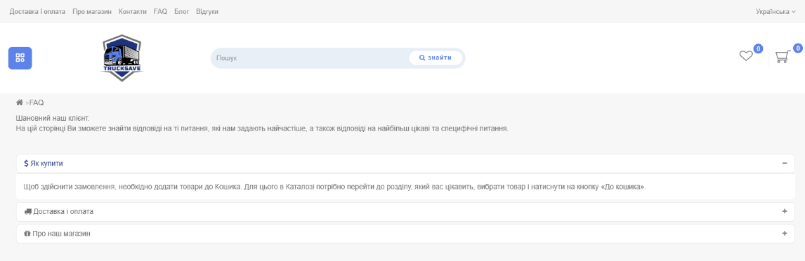
Figure 10 — “FAQ” page
9. Basket
The shopping cart is an important part of the shopping process, which provides convenience and control over the order. Here, users can view the selected products, check their quantity, total cost and, if necessary, make changes before completing the purchase.
We have taken care of the simplicity and intuitiveness of this section so that each customer can quickly and easily complete the purchase. The shopping cart displays all the important information: from the product description to delivery and payment options. This allows users to conveniently manage their orders and make purchases on the site safely.
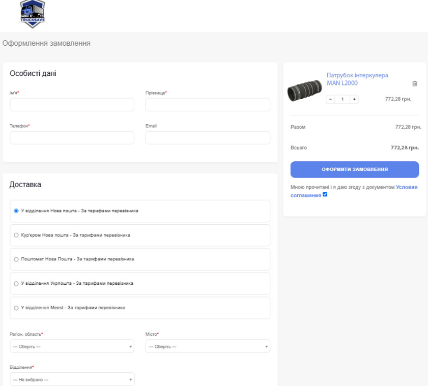
Figure 11 — Basket
Additionally, an online assistant was created and connected for the site via integration with Telegram
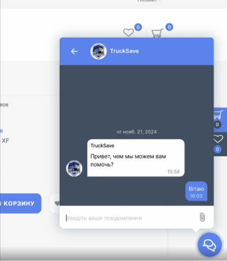
Figure 12 — Online assistant
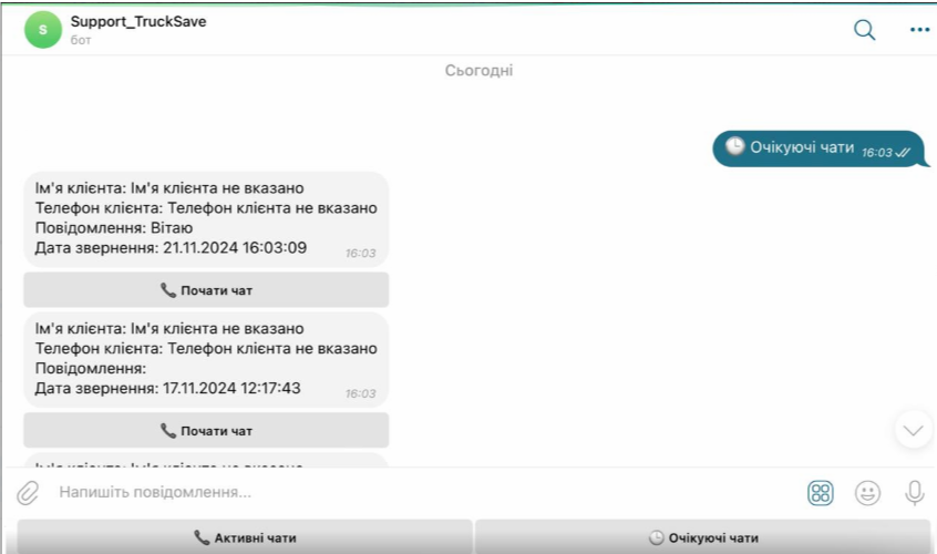
Figure 13 – Integration with telegram bot
 The result obtained


