
 Input data
 Stages of work
Work on the project began with planning, analysis of available data, monitoring of social networks of the customer and competitors.
Our experts held a briefing with the customer, collected and systematized all available data: information, reports, social networks, corporate identity elements, photographs. Based on the received materials, we proceeded to create a website.
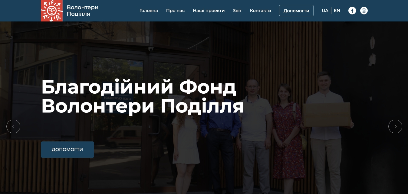
Prototyping, design
Together with the team, we identified 5 main blocks on the main page:
- “About us”
Introduces the user to the fund, builds trust, encourages them to join.
- “Raising funds to help the Armed Forces of Ukraine”
Immediately shows the visitor active “banks”. It must be indicated here what purpose is set for a particular collection.
Under each of them there is an active “Donate” button, which allows you to make a contribution.
- “Report”
If the user, after viewing the first two blocks, has a desire to help, but distrust remains, he will immediately go to the next block with a report on the work done. In each report, you can see photos of purchased cars, things, equipment, products.
- “Our projects”
Here we introduce visitors to the implemented projects of the fund:
- Aid Headquarters of the Armed Forces of Ukraine;
- Resettlement Assistance Headquarters.
- “Contacts”
Information for feedback.
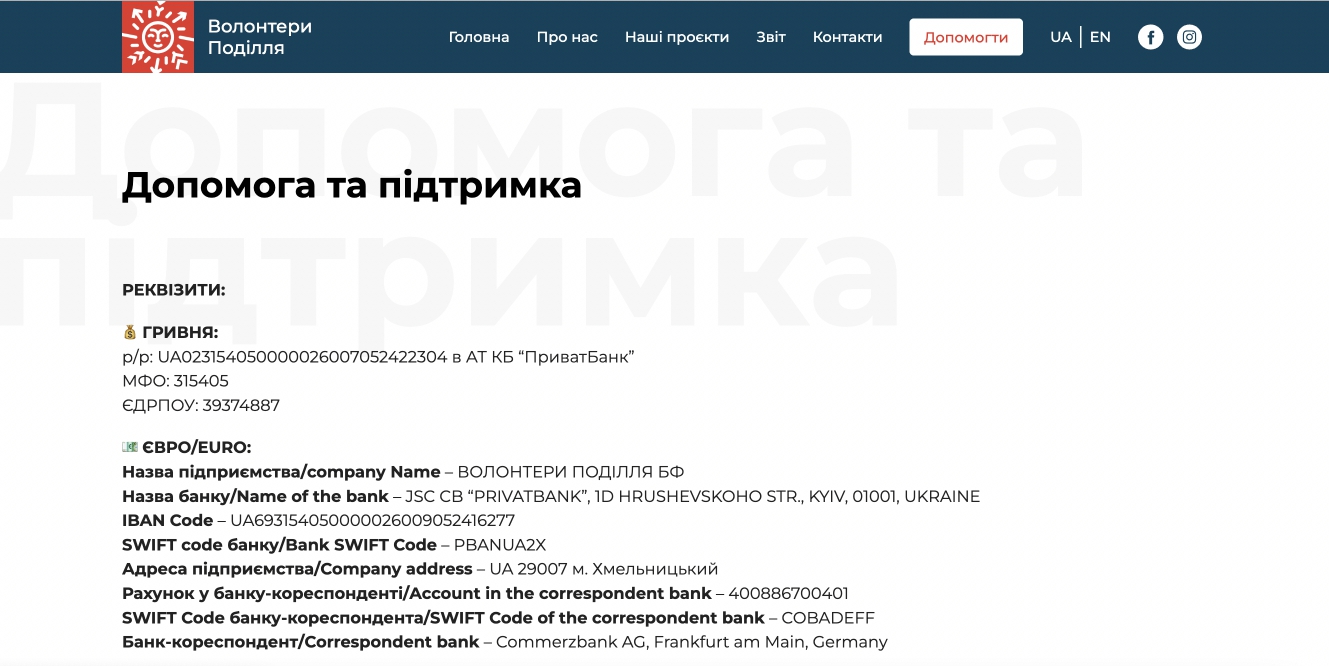
A separate page was allocated for “quick” contributions. The button is in the header, outlined. When pressed, the user immediately sees the details, can make a “general” contribution.
UI: To design the site, we took corporate identity elements from the Fb account.
UX: The user interface is as simple and clear as possible.
Launch site
After agreeing the design with the customer, we started developing the landing page. We used WordPress for this.
The whole process of creating the website took 2.5 weeks. After testing, it was put into operation.
 Results

