МИ ПРАЦЮЄМО ДЛЯ УКРАЇНИ
 Input data
 Progress of work
We did not migrate the old site to a new platform — we designed it again from scratch, based on how the company actually works with its catalogue and how customers look for the equipment they need and get in touch for advice.

Products are added through a form, not through markup
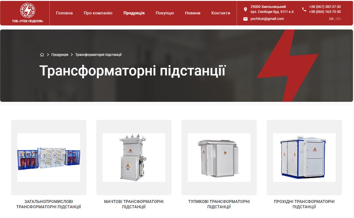
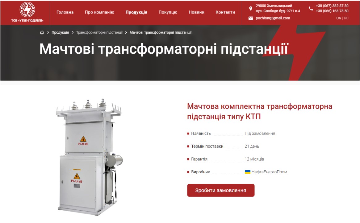
The main problem with the old site was that every product was a separate page built by hand. Adding a new item meant copying an old page and rebuilding its markup; changing the look of the catalogue meant going through every page one by one. On the new site, products and categories are set up so that a manager or director at the company can add a new item themselves — fill in the name, description, specifications and photos, and the page assembles itself. Adding a new product category is just as simple: it appears in the site menu and on the home page immediately, with no developer involved.
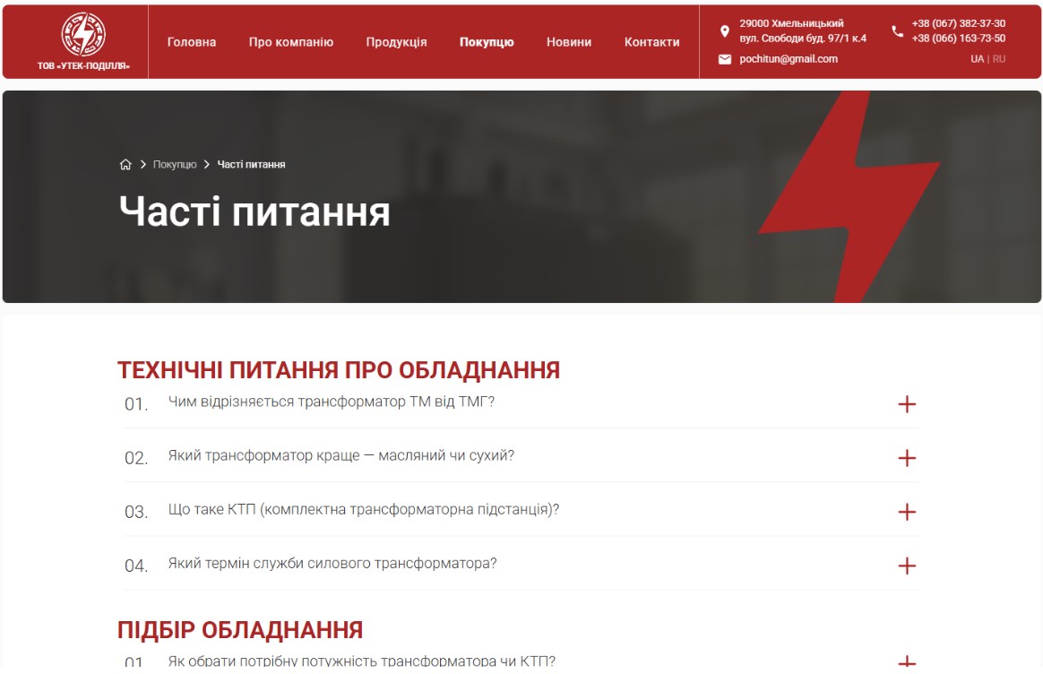
Editing the site’s key pages — “About the company”, “Contacts”, “Payment and delivery” and others — is just as convenient. Instead of one continuous canvas that is easy to break by accident, the editor sees simple fields: heading, subheading, text. Adding a news item or a question to the “Questions and answers” section means filling in a form, not building the page again.
Two languages — one system, not two websites
The Ukrainian and Russian versions of the site run in a single system, so they do not drift apart over time — unlike the situation where a company maintains two separate sites for two languages. Each product has its language versions within one record, so the core product information is not duplicated across separate, independent pages. Search engines understand this too: the site correctly tells Google that both language versions are the same page rather than a duplicate, and that has a direct effect on search rankings. The language only switches when the visitor chooses to switch it — if someone landed on the Ukrainian version, the site keeps them there instead of redirecting them automatically.

Lightweight code instead of a heavy page builder
Instead of a universal page builder that loads the same full set of code on every page regardless of what is actually on it, we built the site on custom code — light, with nothing surplus. Photos are compressed automatically into a modern format without loss of quality, anything outside the initial viewport loads later, and what a person sees in the first seconds loads first. This affects both the experience for visitors and search rankings, since site speed is one of the factors Google takes into account when ranking.
The company gets found by people and by artificial intelligence
On the old site the search side was practically empty: page titles were not worked through for search queries and could display incorrectly in Google results, there was almost no structured data, and images had no descriptions at all. For the new site we wrote titles and descriptions around real search queries and added structured markup, which Google uses for rich results — showing a price or product availability directly in the search results, for example — along with breadcrumbs, the navigation trail that shows the user exactly where they are in the site structure.
Separately, we prepared a reference file for AI assistants such as ChatGPT, listing the company’s categories, products and contact details. This matters more and more, because a growing share of potential customers look for equipment suppliers not only in Google but through a conversation with an AI.
The enquiry arrives even if the email goes missing
Enquiry forms sit directly on product pages and in a pop-up window, and after submitting, the person lands on a thank-you page — which means every enquiry shows up separately in analytics, not just as general site traffic. Every enquiry is also stored in the site’s database: even if the notification email gets lost somewhere along the way, the enquiry remains in the admin panel, so it can still be viewed if email delivery fails.
We also configured the technical side of email sending so that messages do not land in spam — the kind of detail that quietly loses enquiries on many sites, with the business owner only finding out months later, once some customers are already gone.
Old addresses lead to the new pages
The old site already had pages that were present in Google Search and held value for further SEO. To avoid losing those positions when the new site launched, we compiled a mapping table and set up redirects from the old addresses to the new sections — so that anyone following an old link from Google or their own bookmarks lands on the right page instead of an error message. After launch, the site was connected to Google Search Console, the sitemap was submitted, and indexing was checked page by page.
Every change is visible — and can always be rolled back
The analytics we set up count not only site visits but every submitted enquiry as a separate event — so it is clear which pages and advertising channels actually bring in enquiries, while visits from the company’s own staff are excluded from those statistics. All changes go to a test copy first and only then to the live site, so the client never sees the site in a half-finished state, and the change history can always be rolled back.
 Obtained result