
 Input data
 Progress
1. Adding language versions
First of all, we replaced the Open Cart 2.0 platform with Open Cart 3. We chose a new site template with the ability to add several language versions.
Thus, we attracted Ukrainian-speaking and Russian-speaking users from different regions of Ukraine, and also made it compliant with the regulatory requirements of Ukrainian legislation.

Two language versions of sites have absolute copies, and the Russian one is located in the /ru folder, and the Ukrainian one is made by default. Page content, meta tags are given in the desired language.
2. Website audit
Before changing the design of the site, we conducted a detailed audit of it, studied the resources of competitors, immersed ourselves in the company’s business processes, and compiled a portrait of the target buyer.
We found that most of the applications come from wholesale buyers. However, the site design (UX) is focused on retail.
The design of the online store (UI) is outdated, boring, overloaded.
Based on the audit, we have developed a site map in order to think over convenient navigation for both retail and wholesale buyers.
Discussed the visual concept, collected corporate identity elements into a single brand book.
3. Prototyping and design
The next step was the preparation of the prototype. The designers of our team have identified the following pages: home, catalog, product, delivery and payment, blog, article, contacts. Separately, they took out a personal account, a basket. The prototype was approved by the store owners – we moved on to design development.
The target audience of the product is between the ages of 35 and 55, so we abandoned the idea of complex animations, youth transitions. The main principles that we adhered to are simplicity, conciseness, clarity, ease.
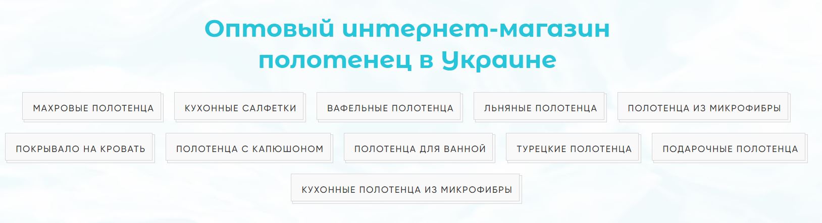
The main page is not overloaded with blocks. Large bright photos of the product make you want to place an order. At the top of the main page there is a block “Wholesale online store of towels in Ukraine”, where you can immediately select the type of towels and go to the catalog.
Then the blocks are sequentially arranged:
- “Catalog”;
- “Popular Products”;
- “Blog”.
The product card contains the wholesale price, since wholesalers are the main target audience of the store. But the buyer can also place an order for retail. We added a postscript: “When buying each product from 1 to 5 inclusive in the basket, the retail price is automatically calculated, which is 20% more than indicated in the catalog.”
The font on the site is large, light, the colors are associated with freshness and purity.
4. Layout, development
After the store design development stage was completed, the layout of the new site was completed. Then we combined the layout design and the backend part. Tested a new product.
The site was on the domain rushnychok.km.ua. We bought a new domain and hosting to make sure it runs fast and smoothly.
 Result


